Life in Redlands
A walkable, independent, and historically significant city in California.
Working with local writers, photographers and a social media manager, I launched a website and Instagram account to promote the city of Redlands, California—my current home.
Client
Self Initiated
Role
Creative Direction
Brand Identity
Web Design
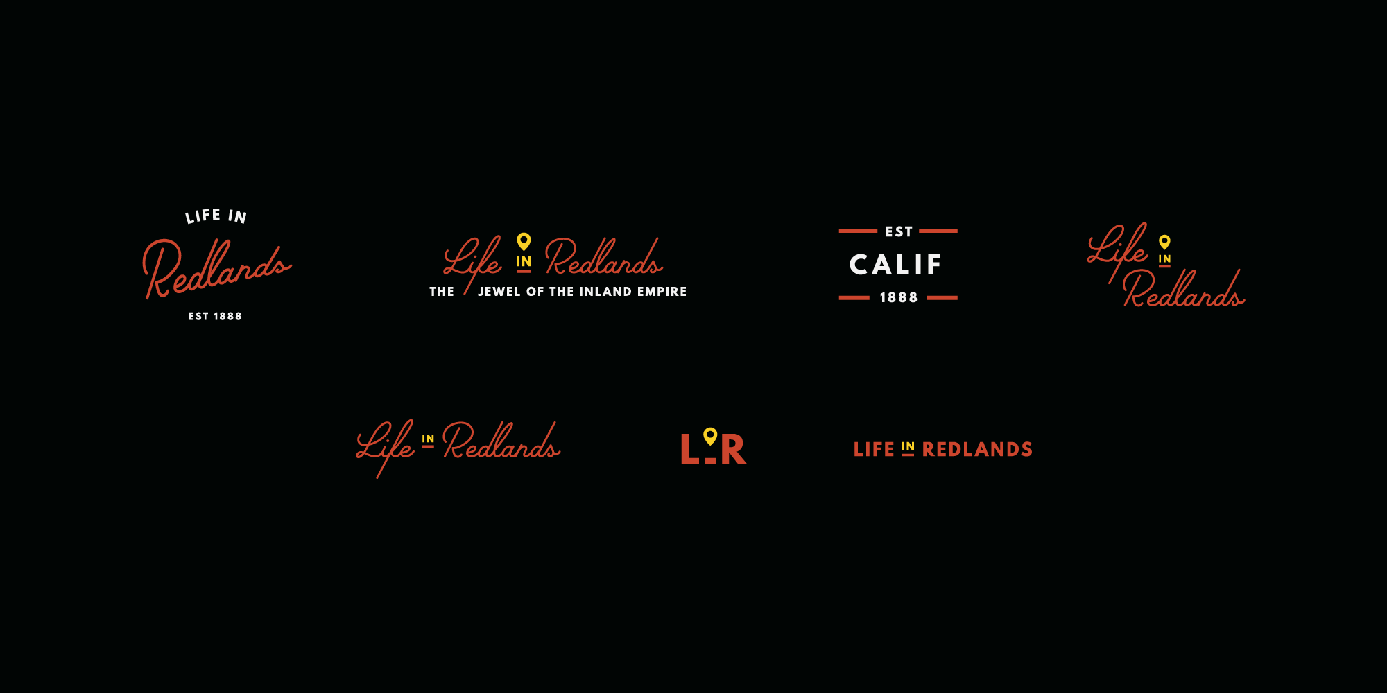
Logo exploration
Background
A walkable, independent, and historically significant city in California.
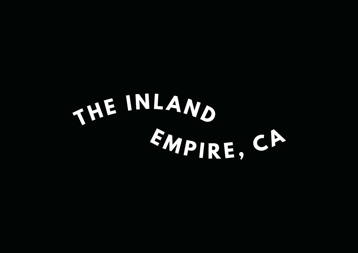
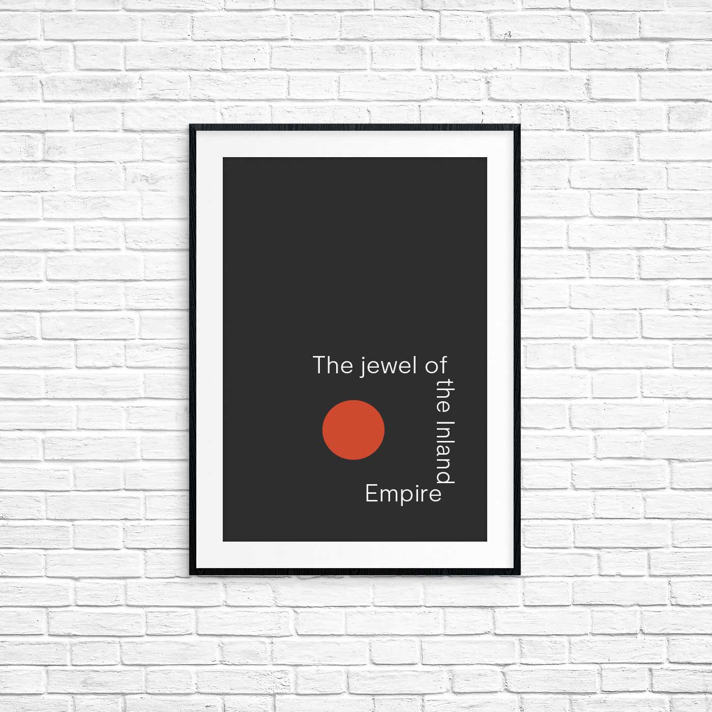
Redlands is a city of 70,000 located in the heart of California’s Inland Empire — the sprawling and diverse region east of Los Angeles. In the late 1800’s, it’s where the passenger train from America’s east coast ended. It’s known as the “jewel of the Inland Empire” for its Victorian architecture, sub-tropical climate and natural beauty.
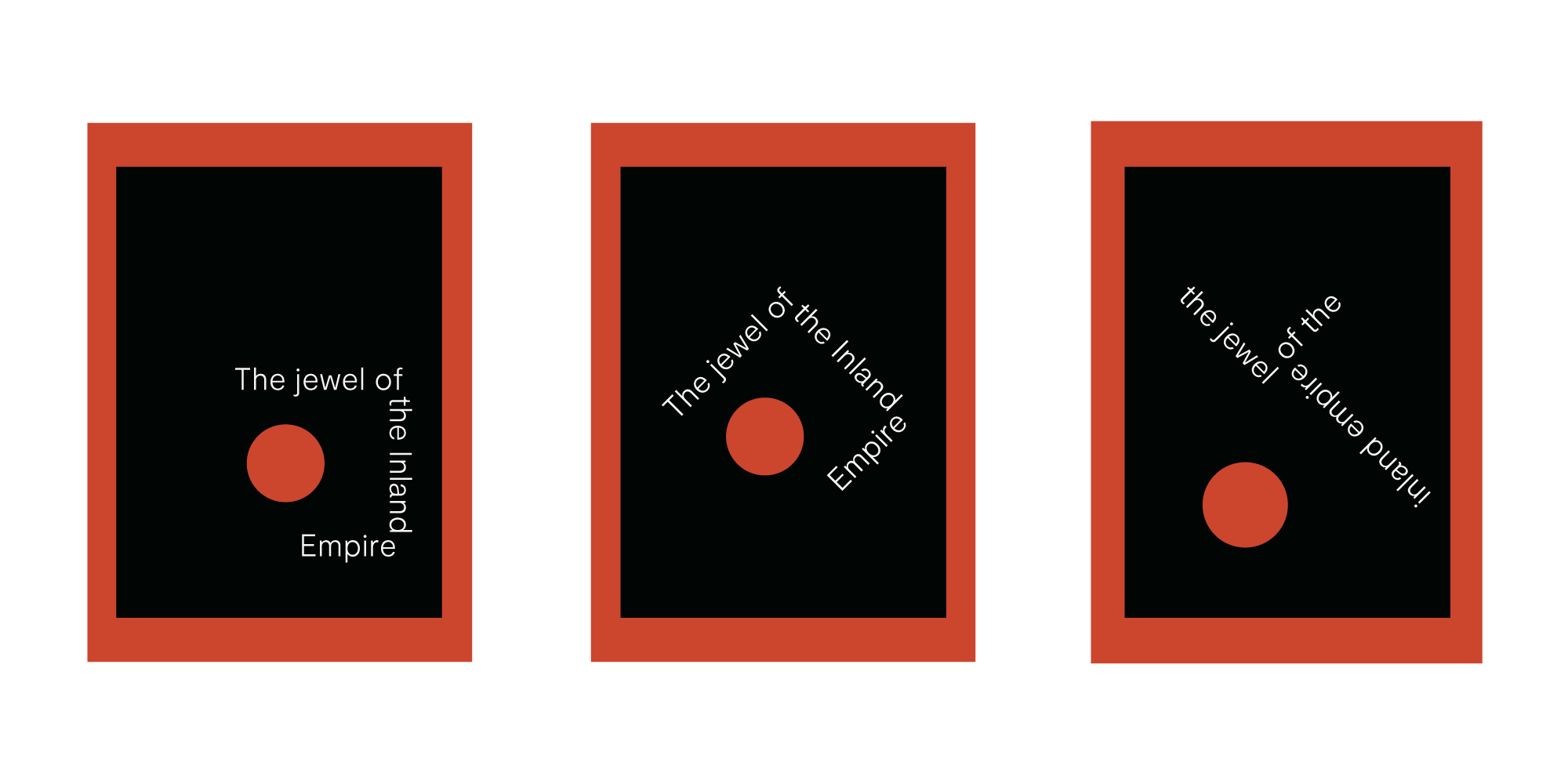
Poster exploration
The Challenge
To communicate the charm of the city to people considering relocation.
The city and region’s underdeveloped—and often negative—reputation is outdated and inaccurate, but enduring. We wanted to create a product to connect people with the community’s independent culture, and through exposure start to shift the dialogue towards something more positive and accurate.
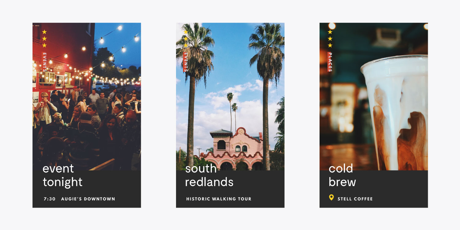
Instagram stories template
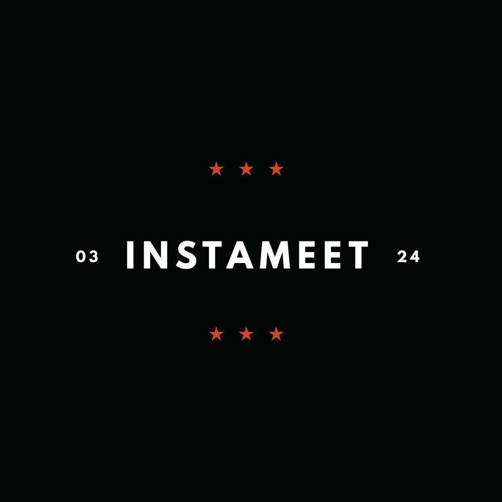
Instagram event template
The Opportunity
A city perfectly positioned for growth.
There are three major employers in the area that already attract people from around the world — a university, hospital, and the mapping company whose technology underpins much of modern life. There’s also a direct train to Los Angeles Union Station beginning service in 2021.
The Approach
An interactive guide to the city.
I thought the best way to bring people into the city digitally was to show it to them. So I created a highly photographic site to catalogue the places that we all love. I made it easy to navigate, and included short, vivid descriptions and high resolution photos by local creatives, that could more accurately explain and promote the city’s independent shops, access to nature, great locally-owned restaurants and cafe’s, and the arts and culture scene.
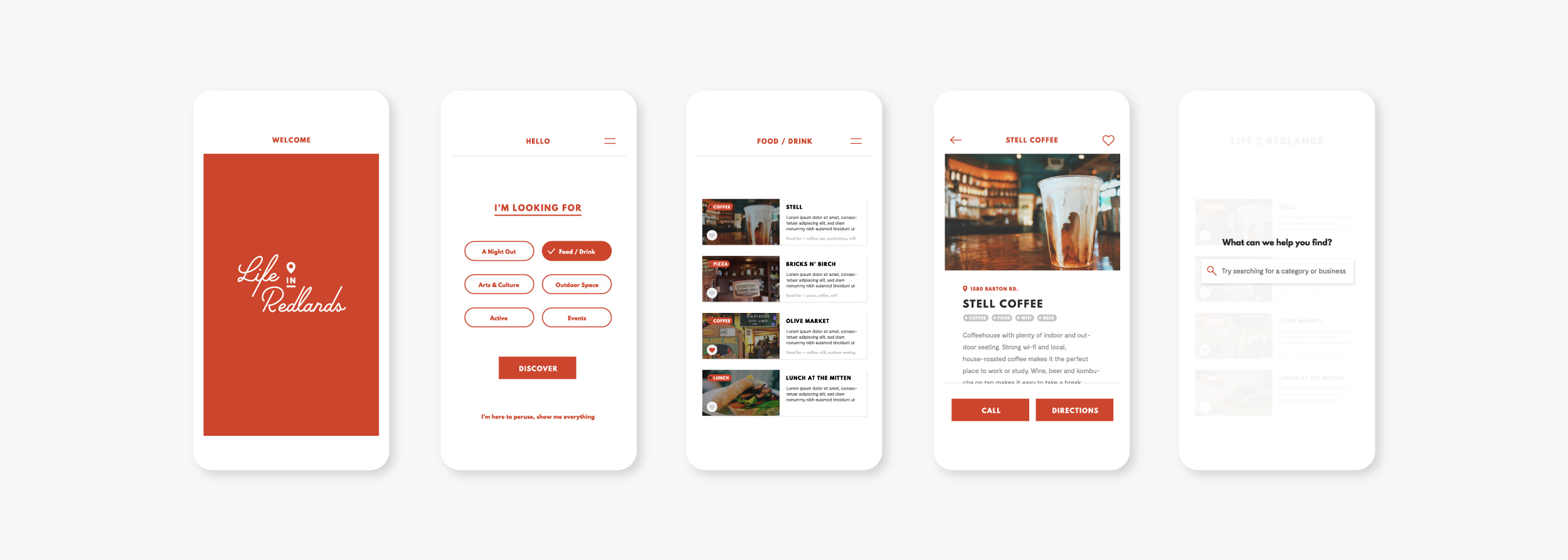
Mobile app exploration
Brand Identity
Strong and clear.
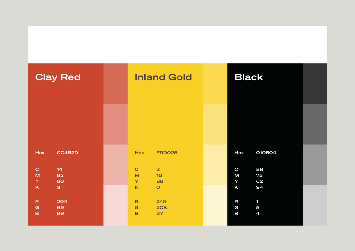
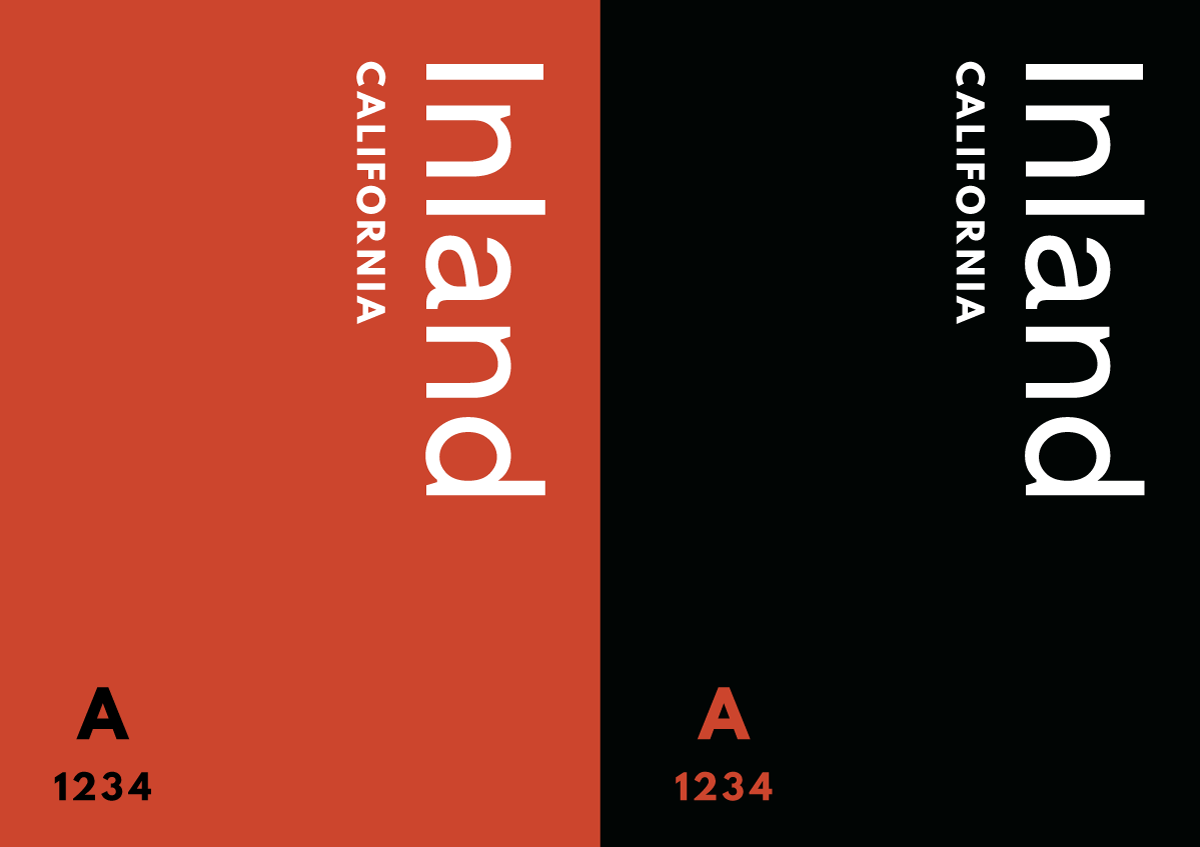
The brand needed to feel classic yet modern, important and Californian. I chose the clay red as the primary color, set against a white or black background on the website and in mobile concepts, with the yellow used sparingly as a secondary accent color. The site’s interface design had to be extremely clear and usable, to allow the content to do the work.
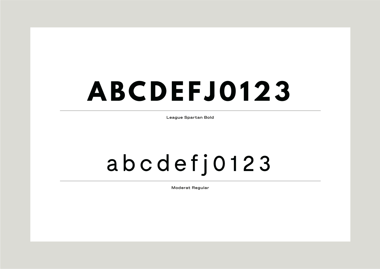
League Spartan and Moderat are contemporary geometric sans-serif typefaces, meeting the criteria of our mission to update and modernize the city’s image. League Spartan is a revival of a classic, making it a perfect fit to serve as this project’s primary typeface.
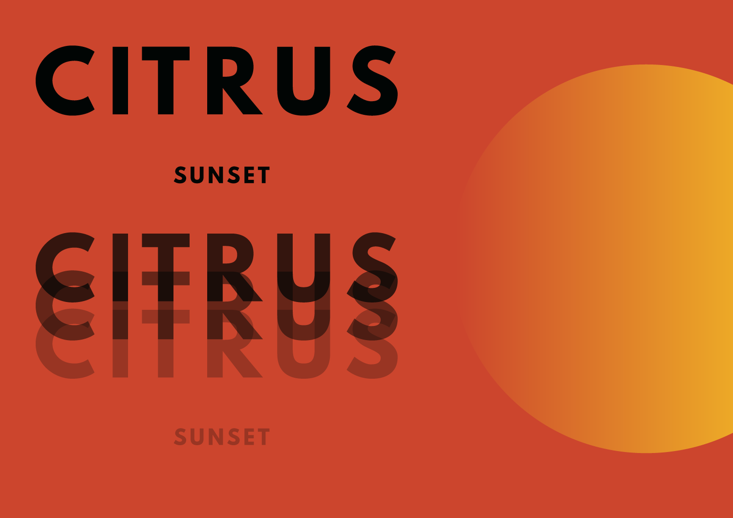
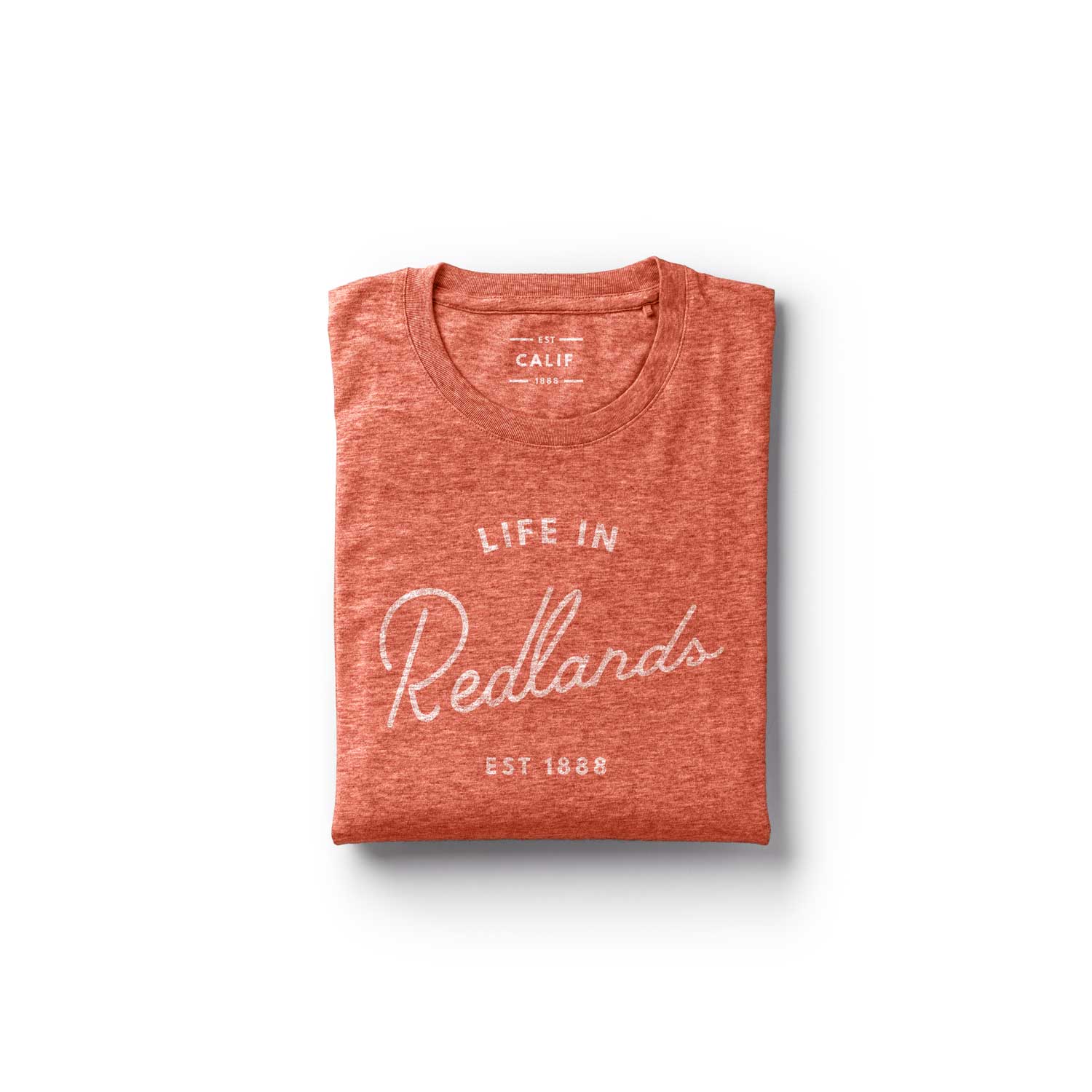
The script logotype is an inland California inspired typeface called “Palm Canyon Drive” created by Orange County based Hoodzpah.