6 Great Design Books
Why design books are good
I can probably present a pretty credible case for why I should be accepted as a minimalist, and ergo my general philosophy on possessing a thing is either a) I don’t need it, or b) digitize it. So, design literature occupies a counterintuitive place in my personal ecosystem. Everything is available online, and books take up space. I think, however, there’s still a case to be made for owning a few design books. In fact, it may be the ubiquity and democratization of information that makes design books so vital.
Books usually don’t follow the same trends that the internet does
To some people, this is not a positive thing. I try not to follow design trends though. It feels reactive, or like running after something you’re never going to catch up to. I found that when I tried to design based on what I saw other people doing, some of what is topical today will last, but a lot of it will be obsolete tomorrow. Instead I would rather focus on what is well-designed. A lot of what was well-designed 40 or 50 years ago still holds up today. International Typographic Style, everything that Massimo Vignelli designed, etc. Books are great for this! If you’re starting a new project or looking for inspiration, instead of logging onto Dribbble (I love Dribbble for other things, don’t get me wrong), pick up an old, classic design book.
It feels nice to step away from the computer
I’ll die on the hill that the best and most productive parts of creative life will be spent entirely offline and away from a screen. Digging through a book is a great place to start, sketching out some ideas on paper, going for a walk, thinking about the problem, etc. Computers are great, but they don’t solve problems on their own. The case for a design book is also a plea to refocus, reevaluate the creative process, and use your mind to solve problems rather than the confining limitations that a computer presents.
All of that said, if you’re convinced, here’s my non-exhaustive list of design books that I think are worth owning! If you have suggestions or complaints, send me an email hi@studiopaolo.co or scream at me anonymously via the traditional twitter dot com.
A History of Graphic Design
By Philip B. Meggs
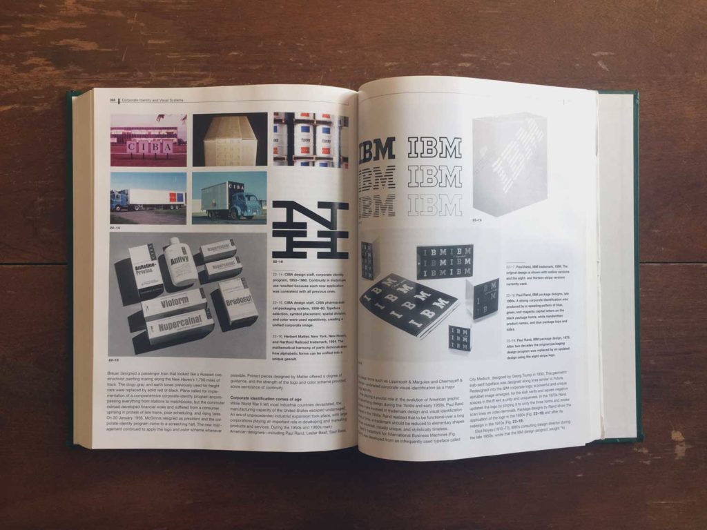
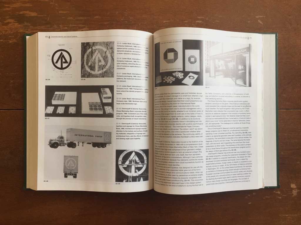
If you went to school for design, this may have been one of your textbooks. It’s actually a great, unsurprisingly comprehensive journey all the way from the invention of writing, through the printing press, and continuing on into the “Age of Information”. I picked up a copy of this book after I finished school, and I still find myself referring back to it often.
Making and Breaking the Grid
By Timothy Samara
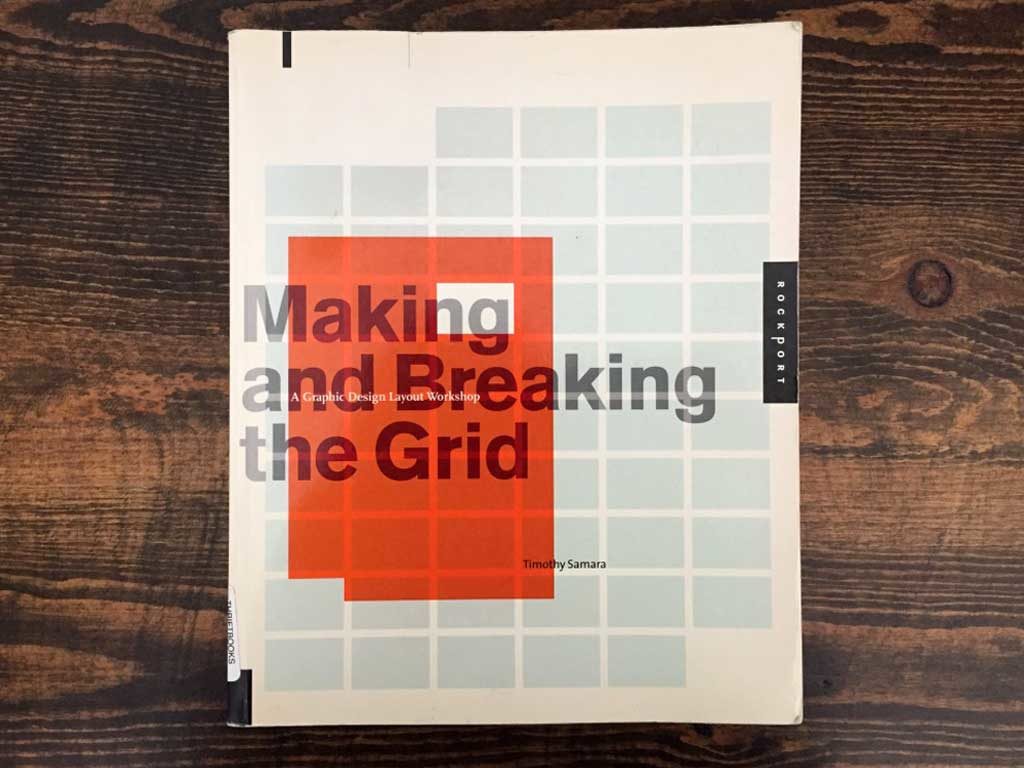
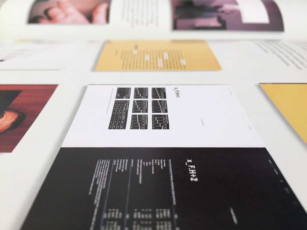
This is another classic that you might remember from design school. Unlike the history textbook though, this is one that I didn’t purchase immediately after I graduated. It was more of a slow burn. But, I kept thinking about it, and years later it’s become an essential for me. On any project, it’s so useful to have a technical foundation to work from. This book is especially great for that. I bought a used copy of this book, so some of the example layouts look a bit early 2000’s now, but the information is still good. If you’re looking for a copy now, it’s probably worth picking up a second edition.
Grid systems
By Josef Müller-Brockmann
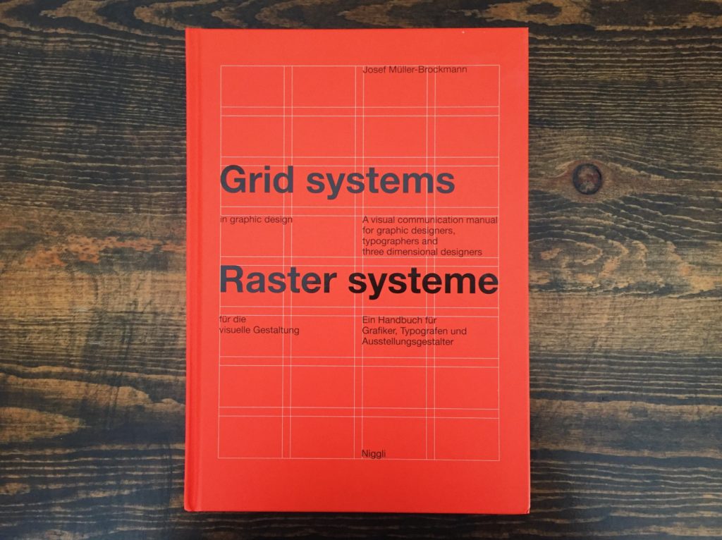
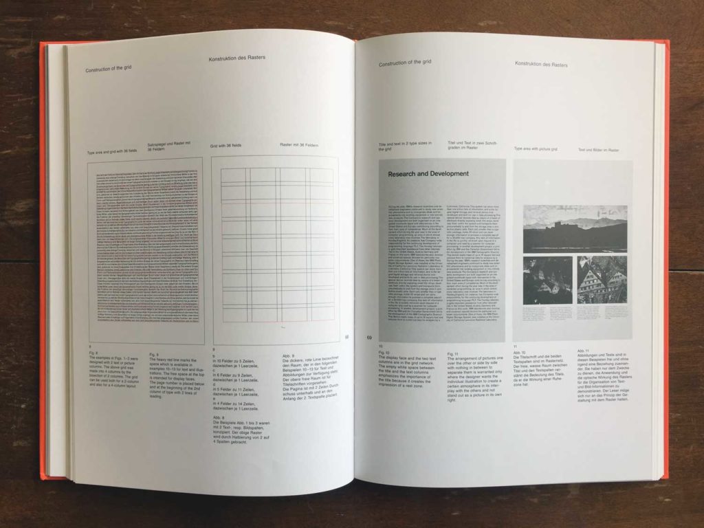
Originally published in the 1980’s, “Grid systems” is billed as a “visual communication manual”. It sets the groundwork for the use of grid systems as a method for clarifying, concentrating, integrating various elements, and preparing for the future. It proposes grid systems not as a tool for limiting creativity, rather as a philosophical, ordered system for keeping the design rational and honest. It’s also a very good typographical guide, and a great reference on any layout project.
Grid Systems
By Kimberly Elam
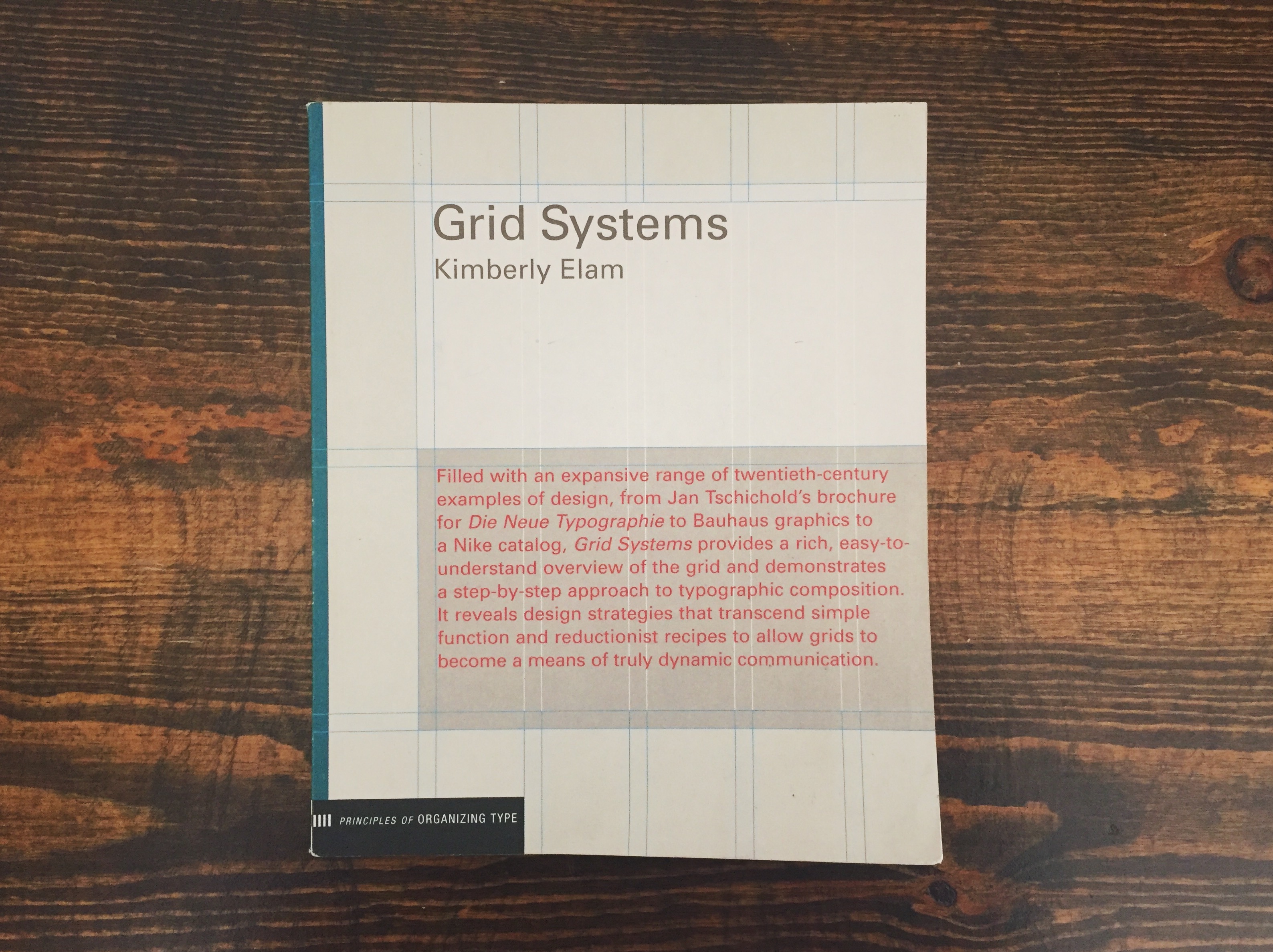
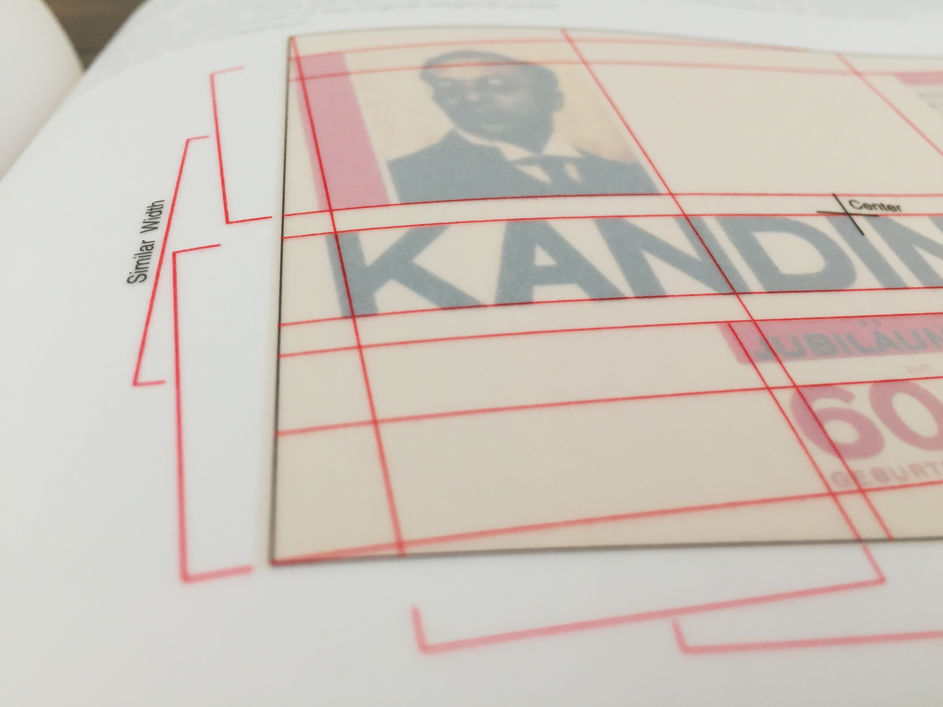
The third and last grid book I’ll mention here and a book that is also titled ‘Grid Systems’. Unlike the last one—which is also about typography and establishing oddly strict rules—this book really is purely focused on the grid. Featuring more examples, overlays that help to explain the composition and division of space, and several critiques of various grid structures. If you’re working on any sort of type-heavy layout design, it’s the most versatile of the three grid books listed here and basically a requirement!
American Trademark Designs
By Barbara Baer Capitman
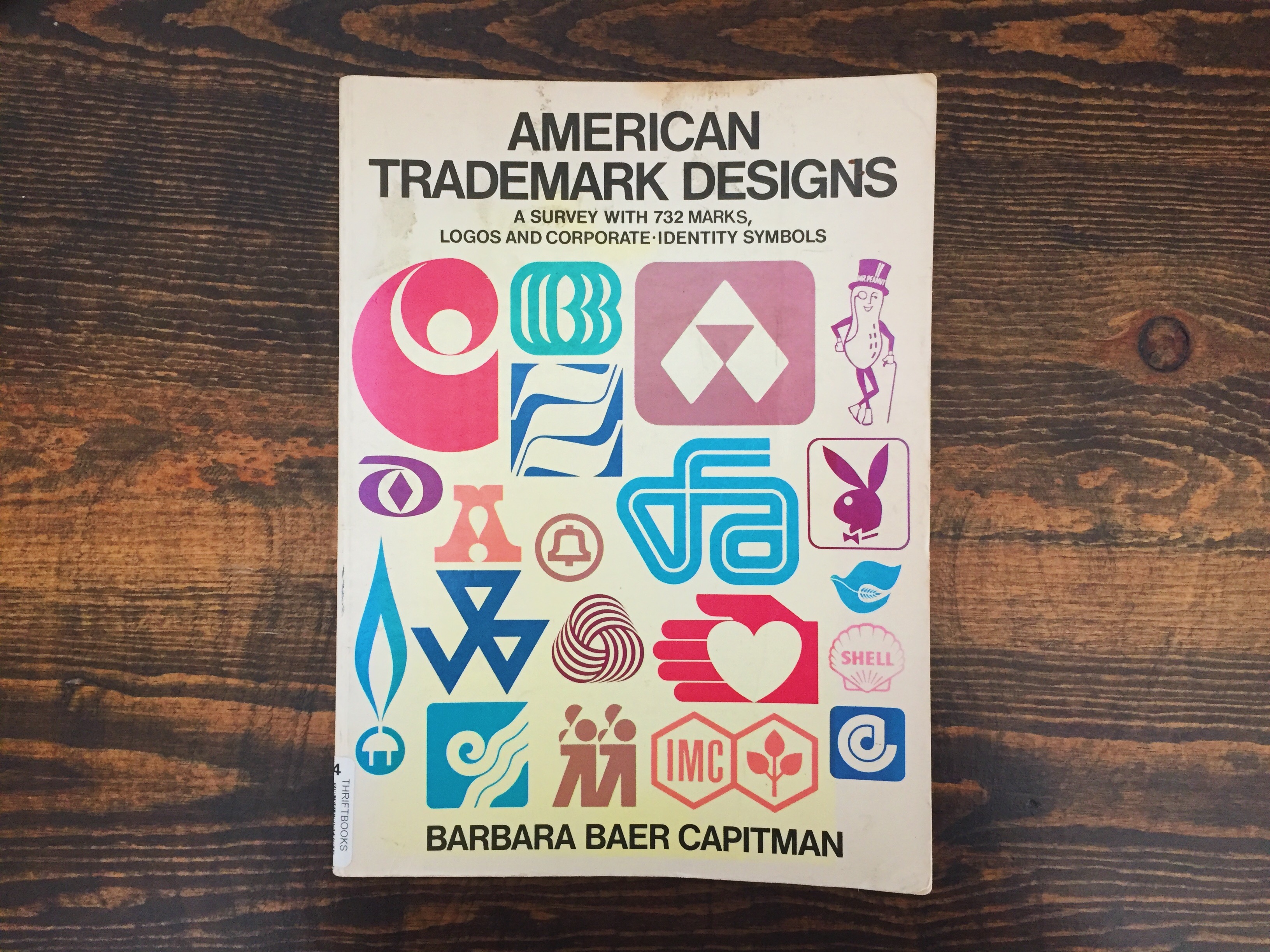
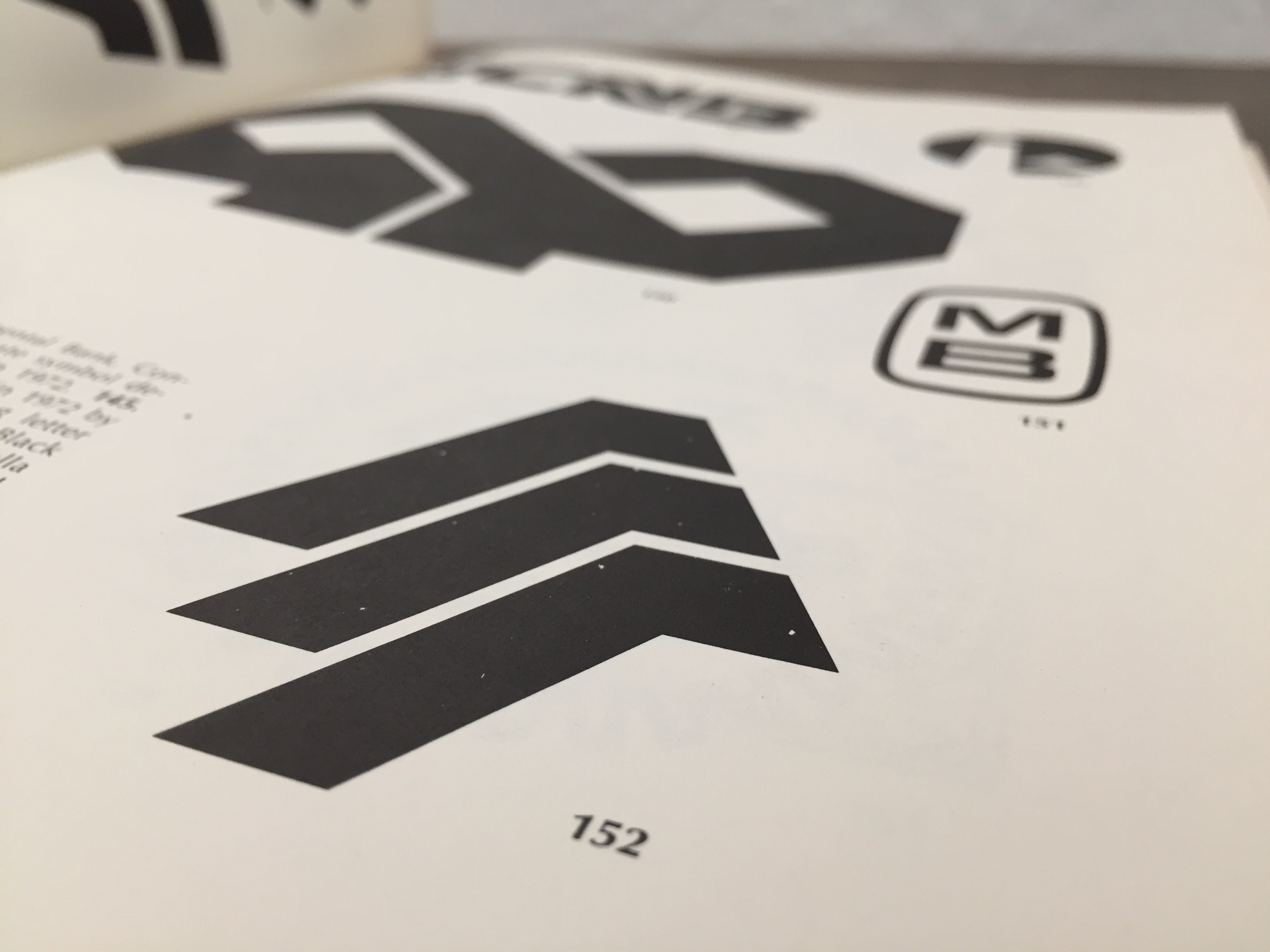
I don’t think there’s another book that I refer back to more than this one. I can’t even really remember where I picked it up, or why, but there’s no writing or analysis at all. It’s just 732 colorless logos (and… ‘corporate identity symbols’ obviously). My logo design process usually starts by flipping through this book to get ideas, and then I start sketching out shapes and ideas. I’ve seen many similar books to this one, and I’m sure that most of them would also be very good.
Thinking with Type
By Ellen Lupton
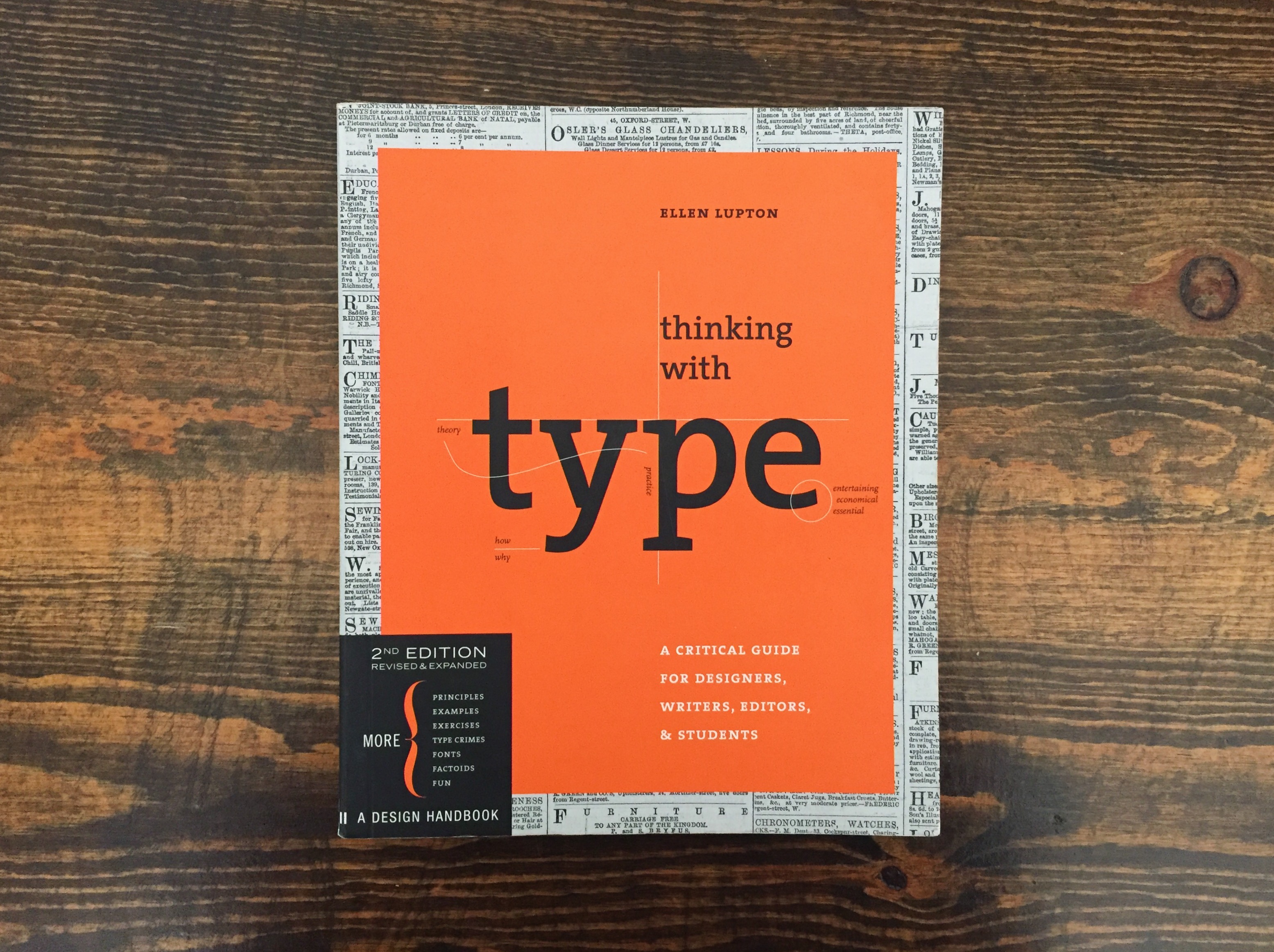
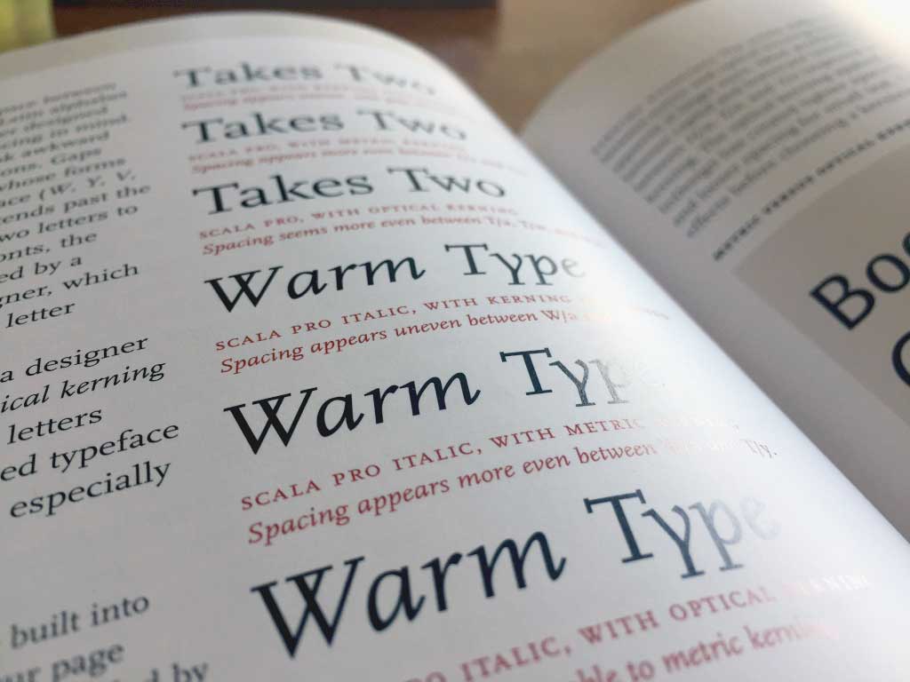
If you want to tighten up your typography game, or if you’re just in need of a brush-up on terminology, this is an ideal book to keep on hand. It’s convenient to refer to if you’re presenting or writing something about design. It’s also helped me talk about my own work, and clarify my reasons for making certain design and type decisions. It’s full of examples, explanations and… more grids!