San Bernardino County Museum
Rebranding a local institution.
I was approached by the curator and asked to design the museum’s initial logo and brand identity.
Prior identity had been tied to the county government, which was allowing the museum to explore autonomous branding for the first time.
Client
San Bernardino County Museum
Role
Creative Direction
Logo Design
Brand Identity
Visual Systems
The Opportunity
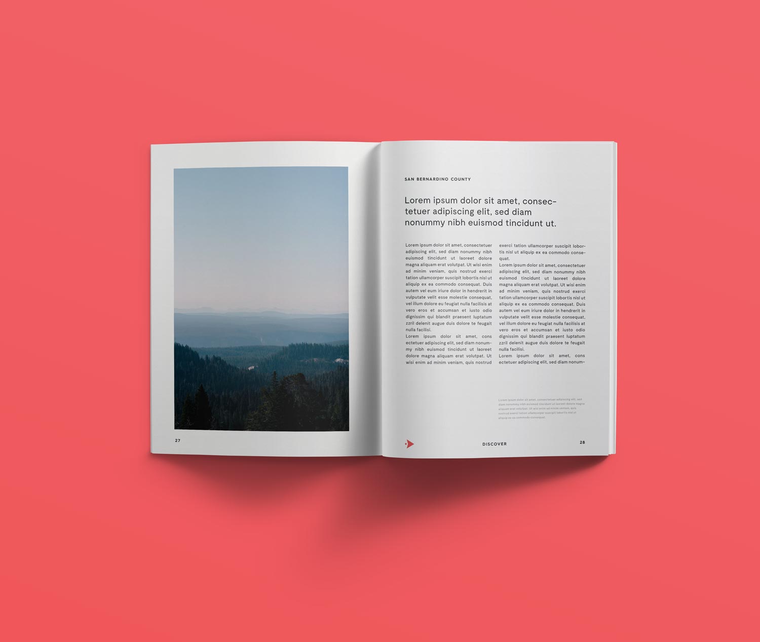
San Bernardino County is one of the largest and most geographically diverse counties in the United States. It covers more land than nine US states and 70 countries. The county includes 35 wilderness areas, a national forest, parts of two national parks and the highest peak in Southern California.
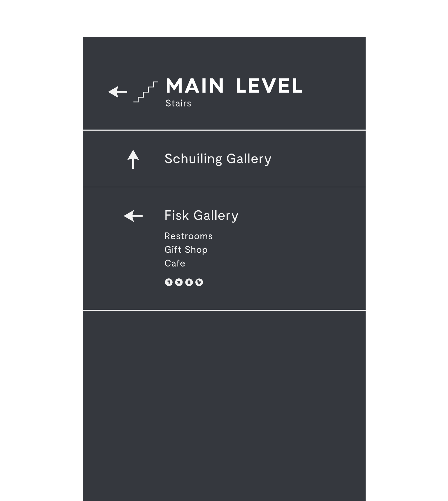
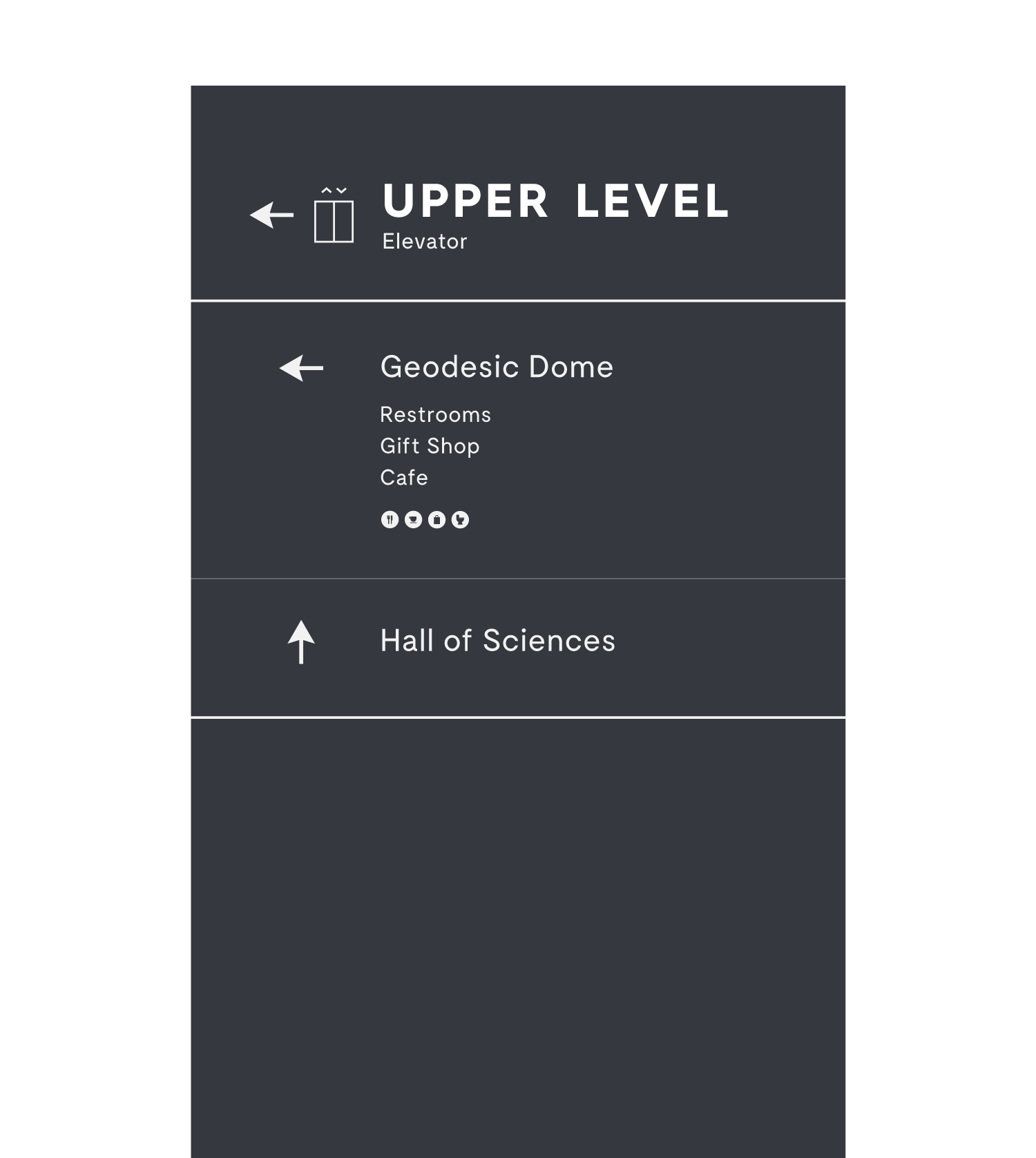
The county’s astounding natural and human history, as well as the museum’s unique geodesic dome have been a draw for school trips and nostalgic adults for decades. This was an exciting opportunity to give a new voice to a southern California institution.
Objectives
Work with the museum board to design a new logo
Bring the museum into the modern era with an independent brand
Clarify the new brand with a set of visual guidelines
Strategy
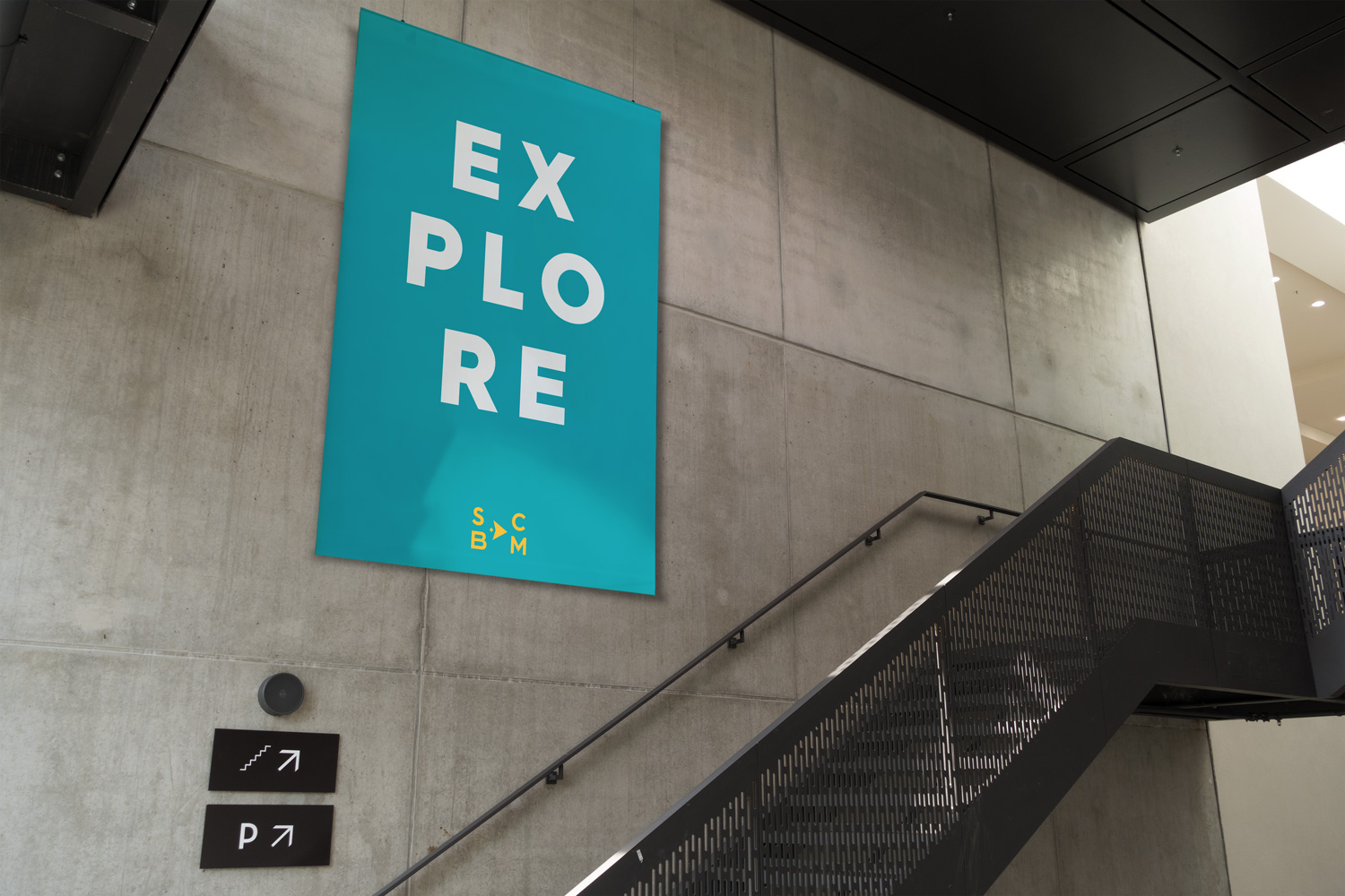
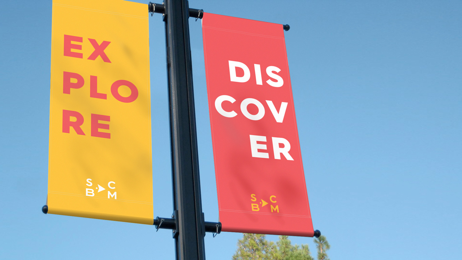
A substantial percentage of the annual visitors arrive via school trips. The curator made it clear that the ideal branding should be playful in order to appeal to young students, but also visually appealing enough to engage the region’s booming millennial population.
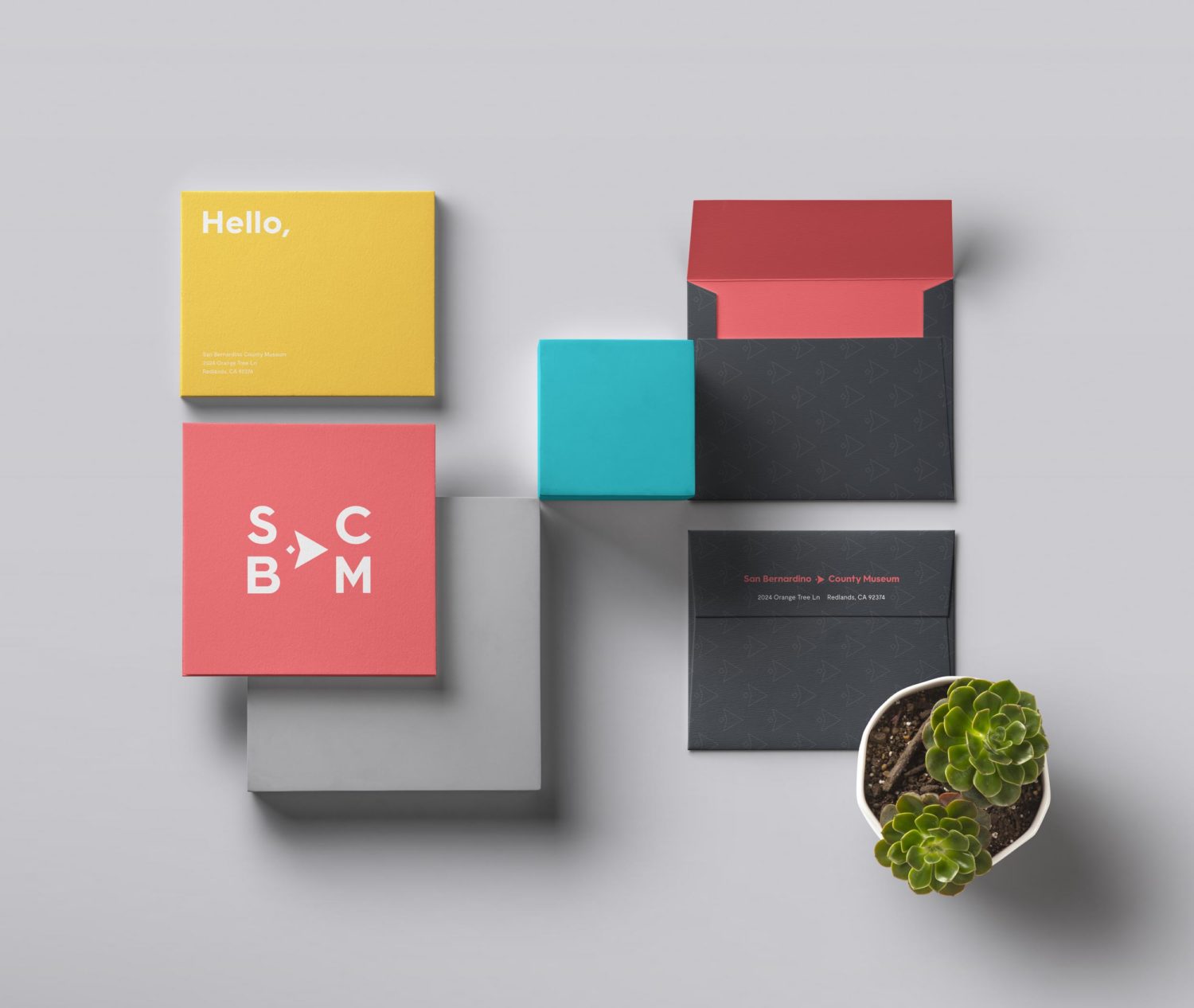
Primary Colors
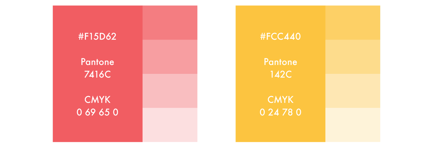
Secondary Colors
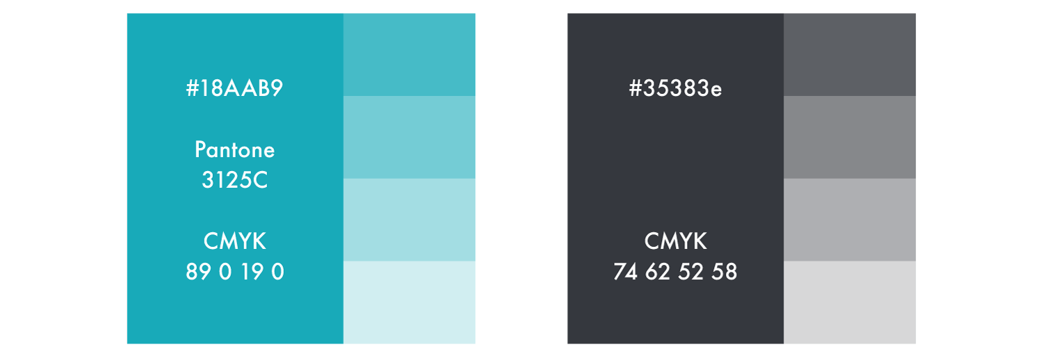
We selected a bright color palette from natural elements found in the region’s desert and forest flora.
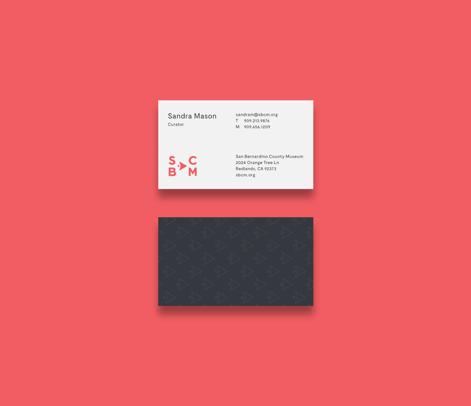
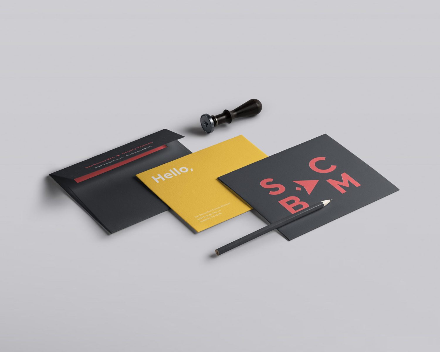
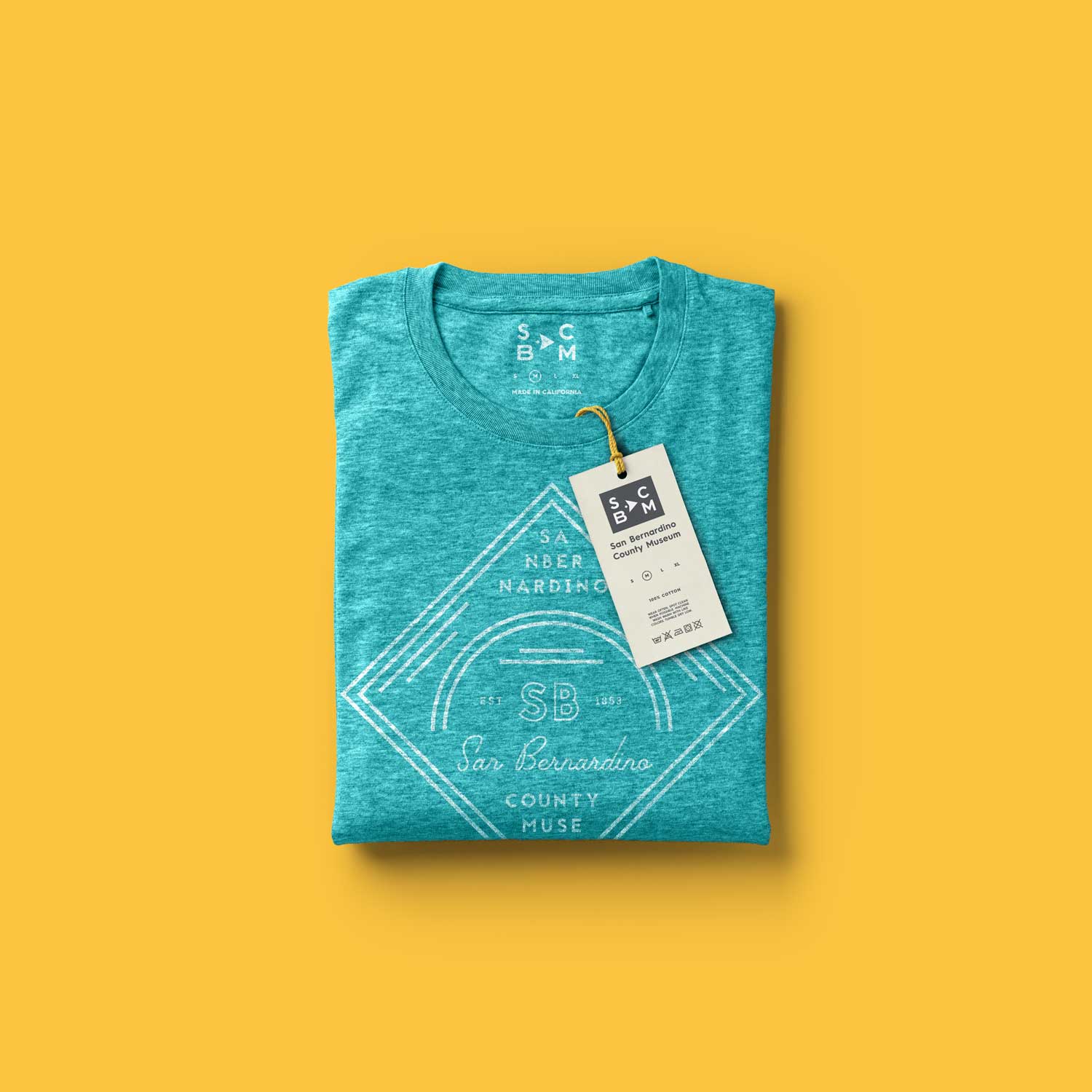
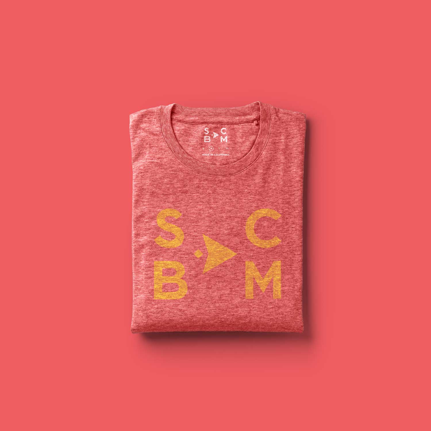
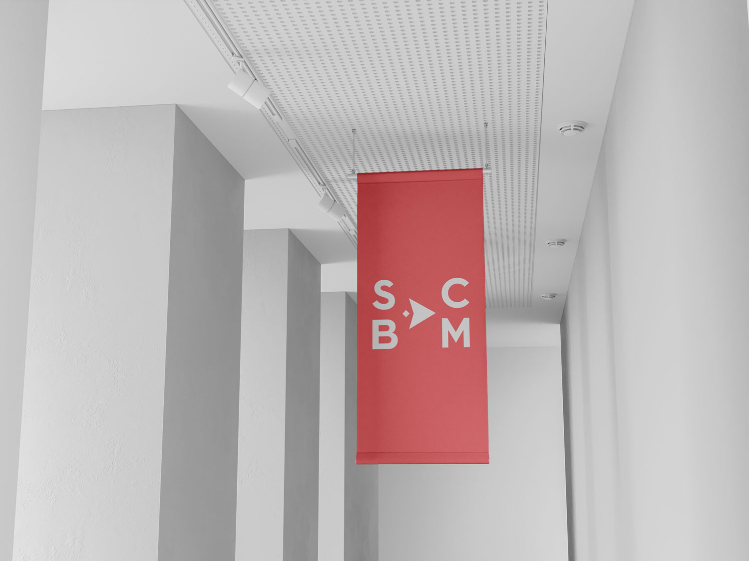
The Logo
After an initial brainstorming session we decided that to maximize our chance of the county’s approval, the logo absolutely needed to maintain a visual connection with the county’s arrowhead.
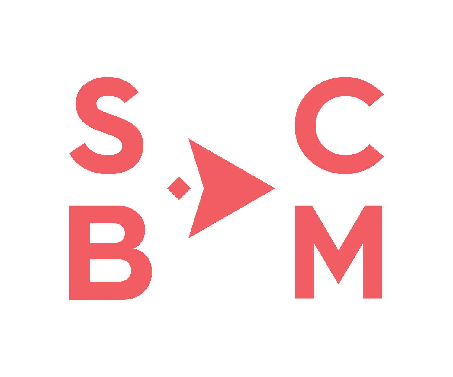
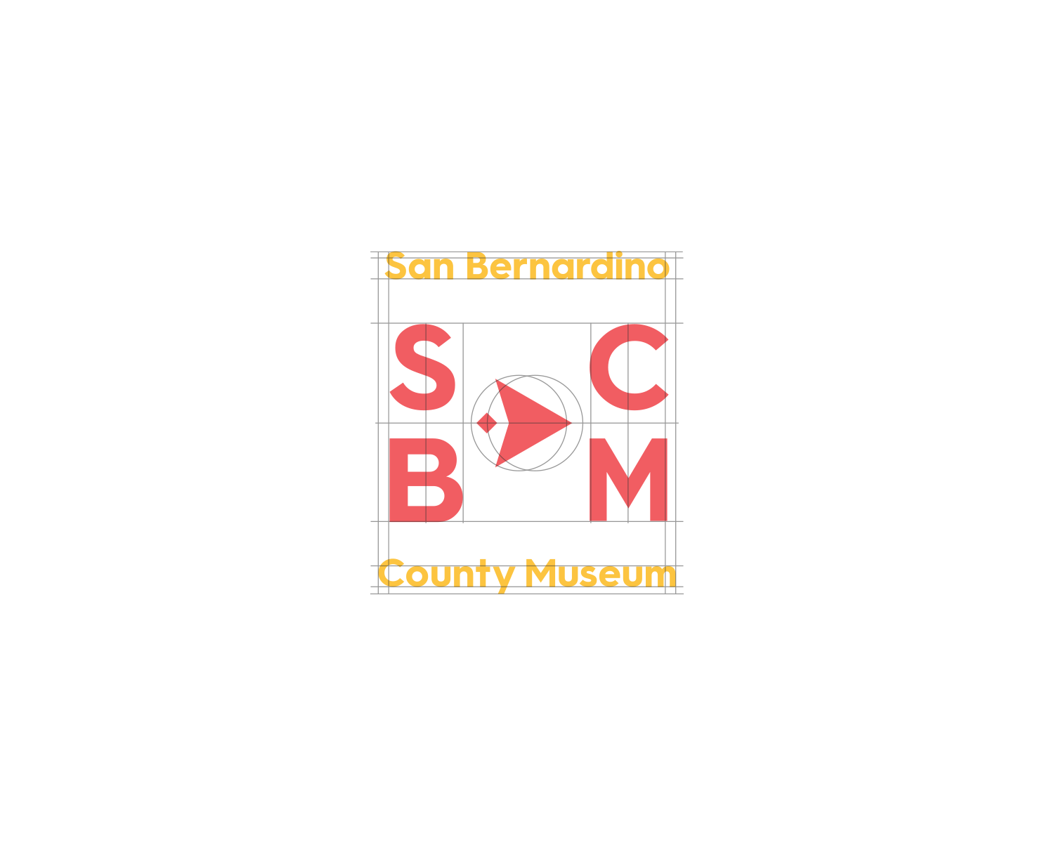
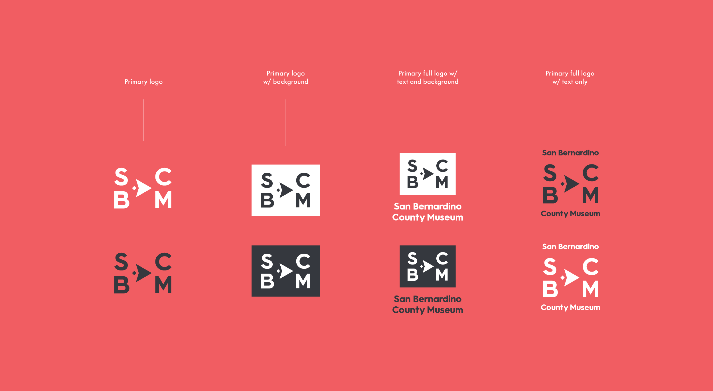
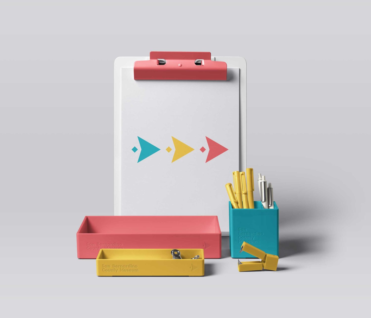
In considering what the logo should represent, the concept of moving the museum forward became a central theme to the rebrand.

The museum’s arrow points to the right, indicating forward movement along an x-axis.
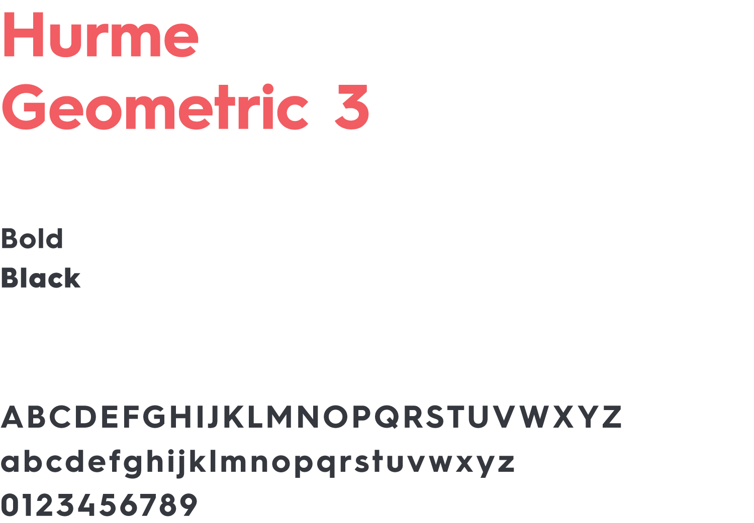
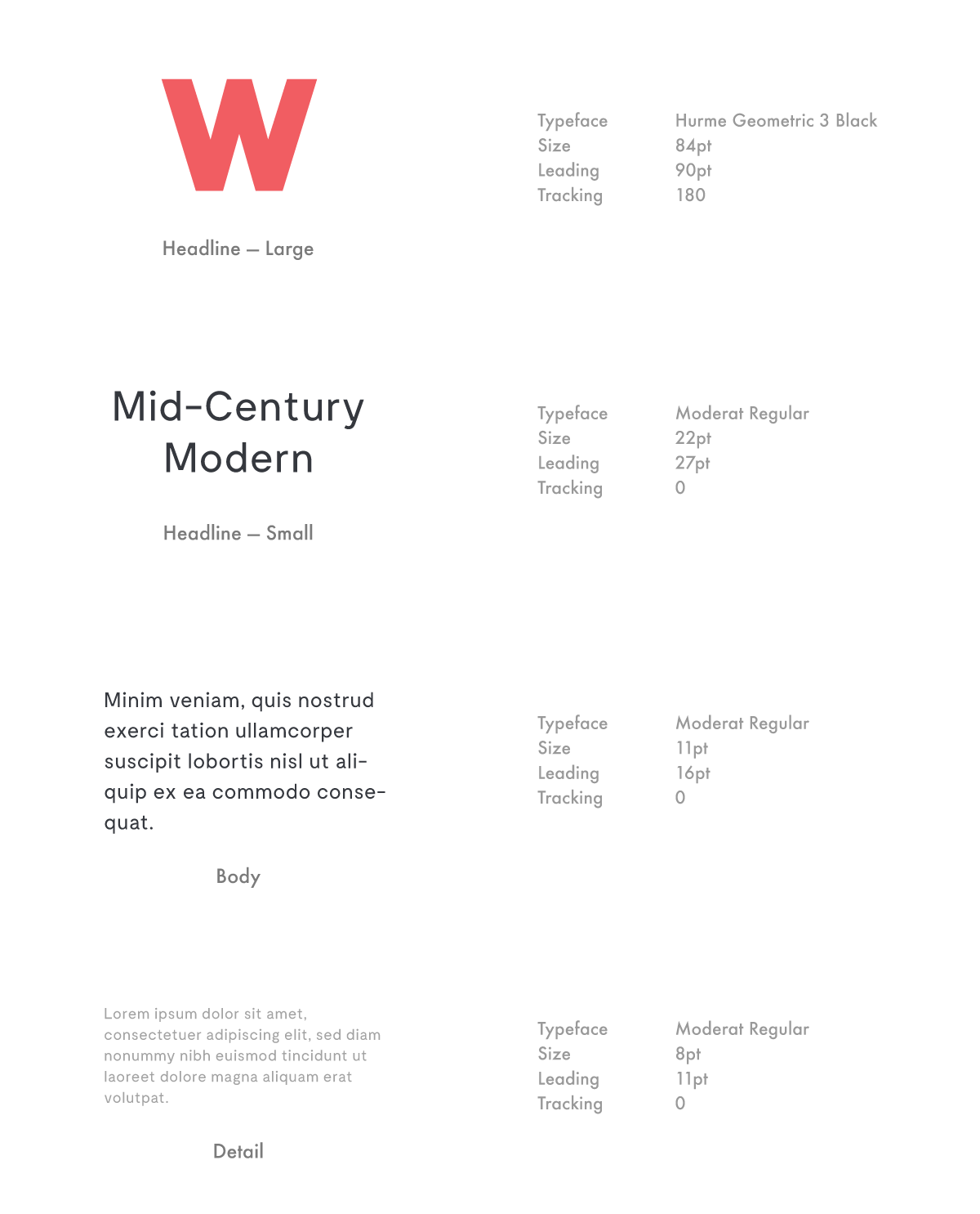
Primary Typeface
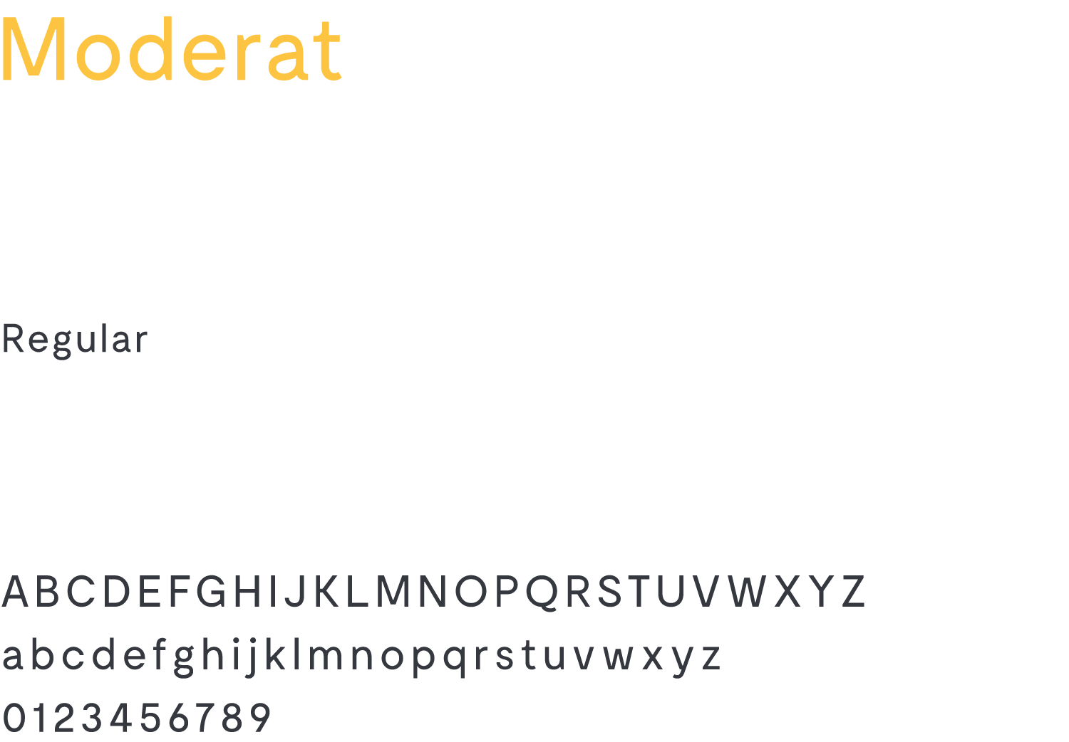
Secondary Typeface
As a nod to the museum’s mid-century geodesic dome and the region’s modern architectural history, I selected two complimentary sans-serif geometric typefaces. Hurme’s thick black weight for the large headlines, and the lighter Moderat was selected for body copy and smaller headlines.