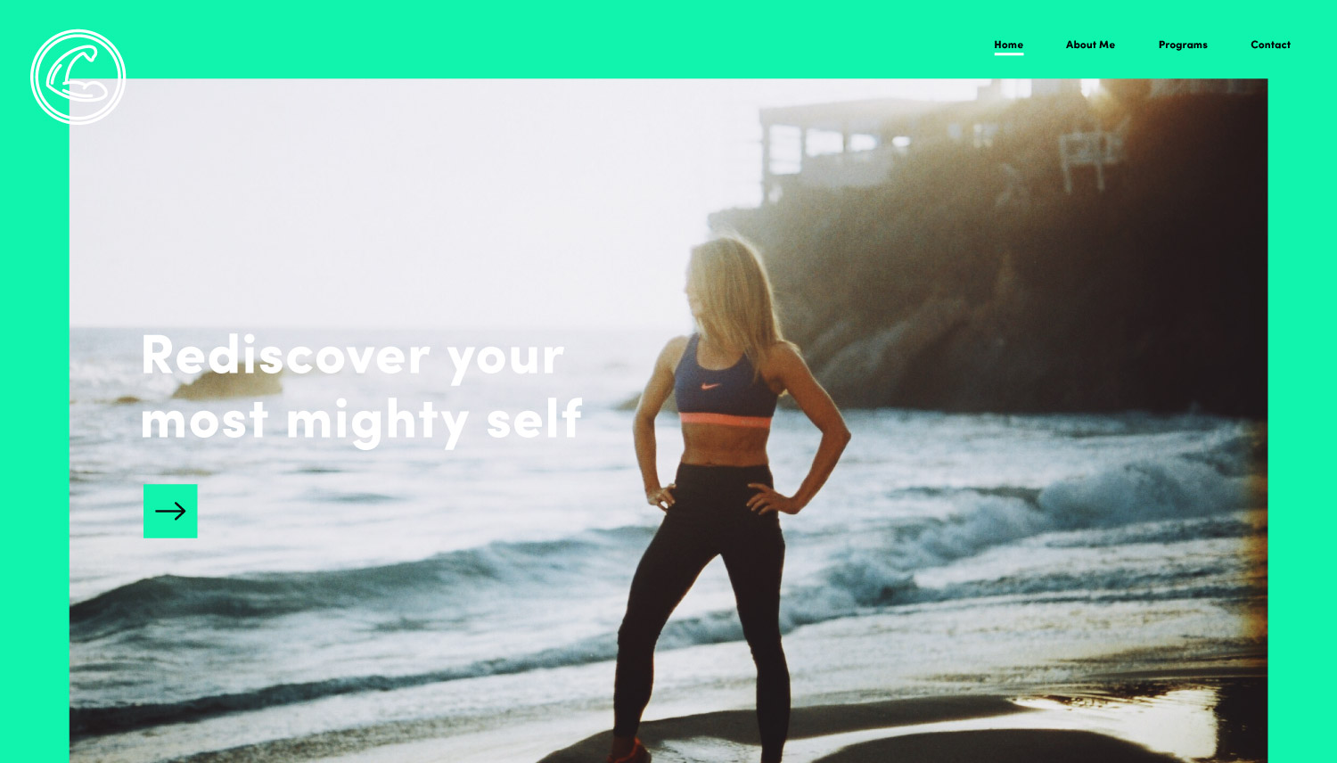
She Mighty
An exploration of physical strength.
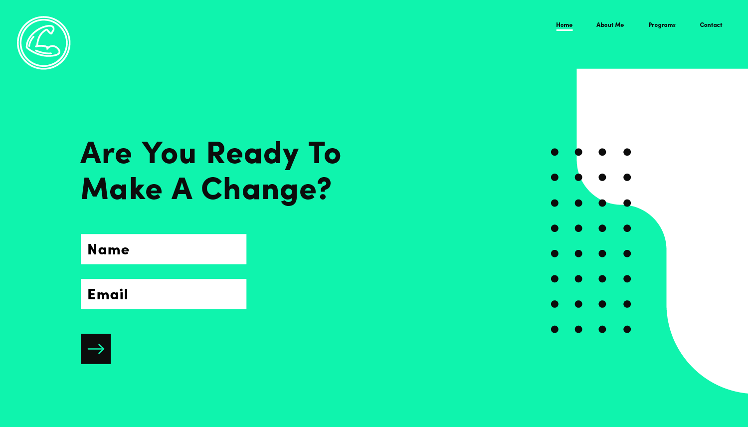
I designed the logo and brand identity, and also designed and built the website for She Mighty, a women-focused health and fitness company.
Client
She Mighty
Role
Creative Direction
Brand Identity
Web Design
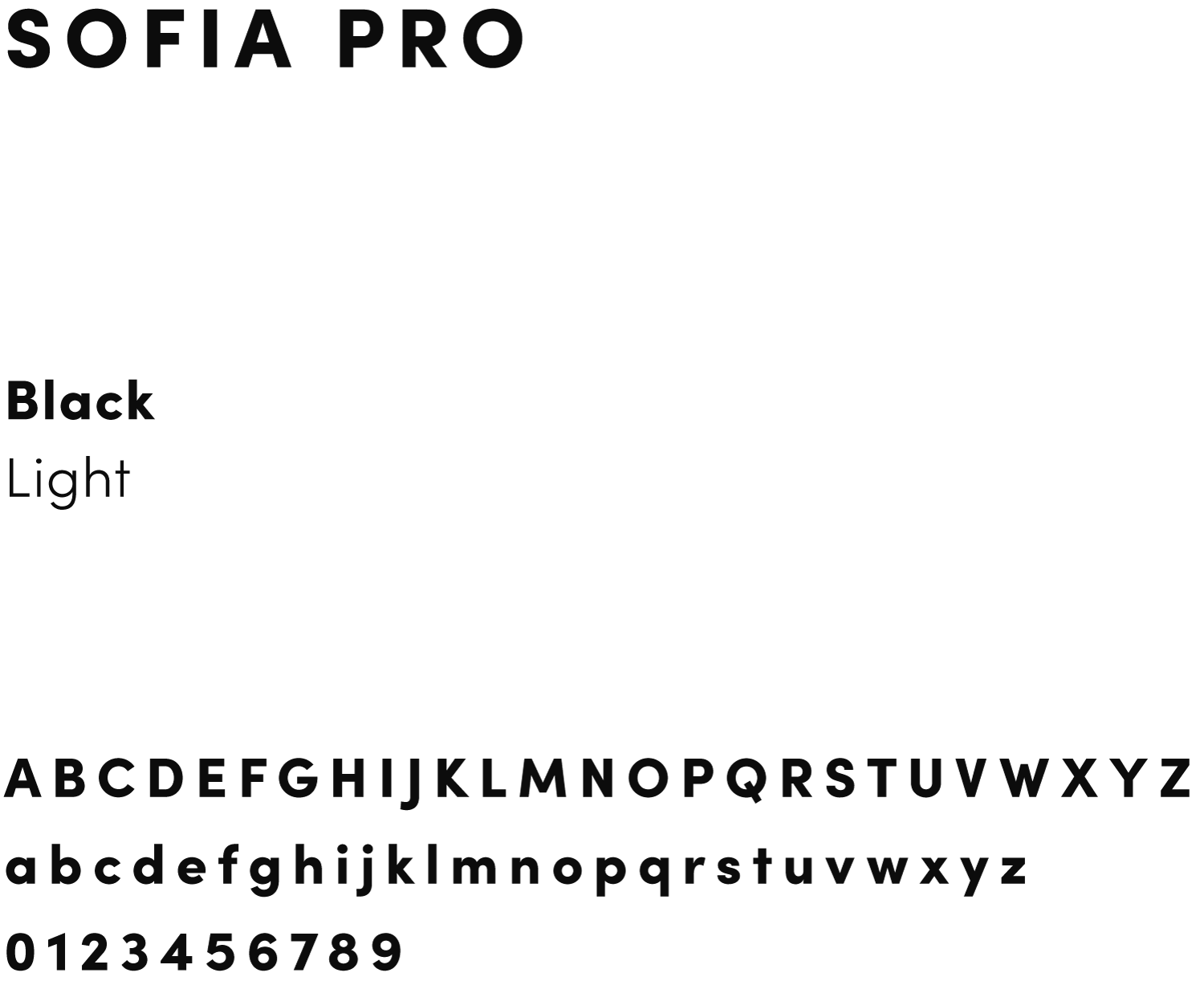
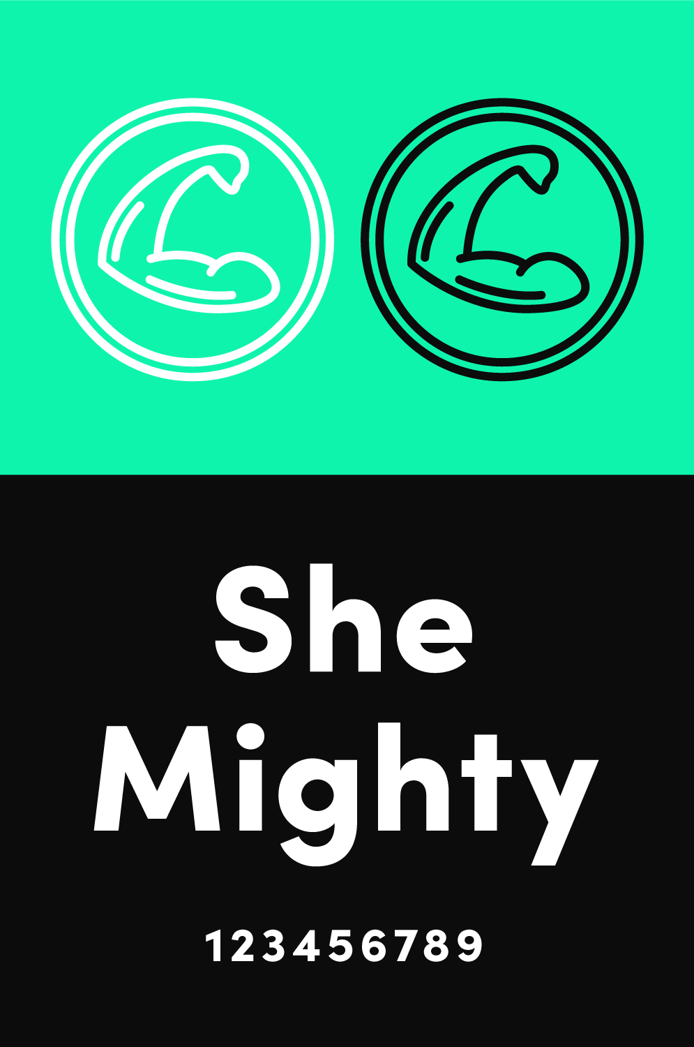
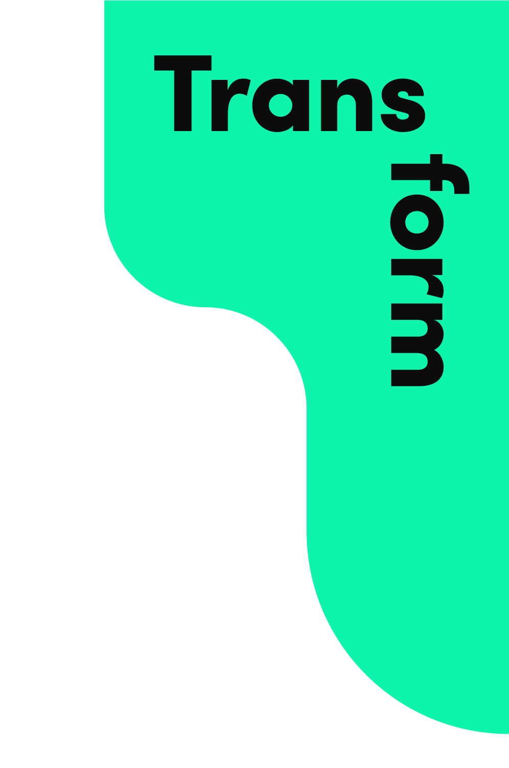
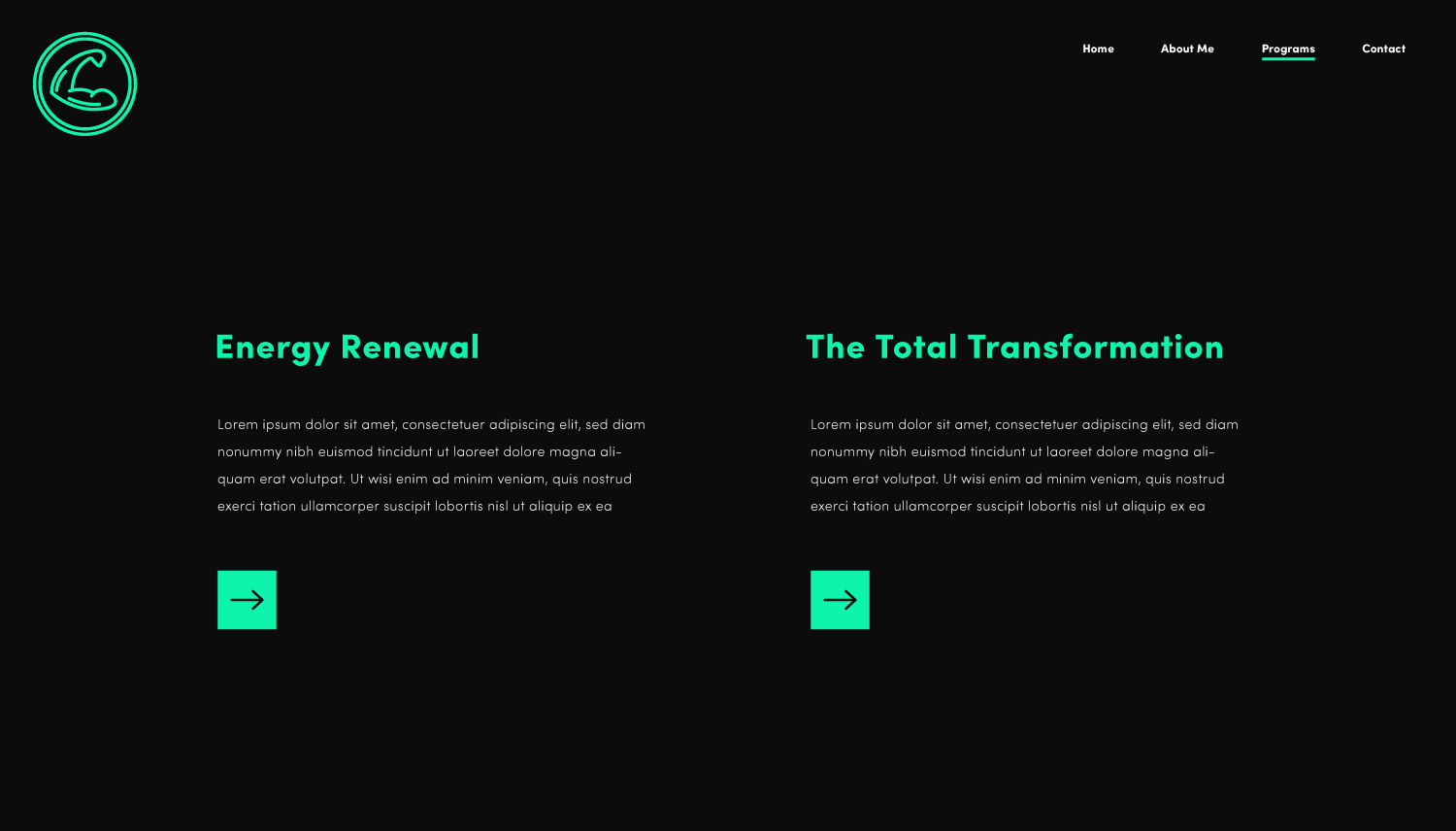
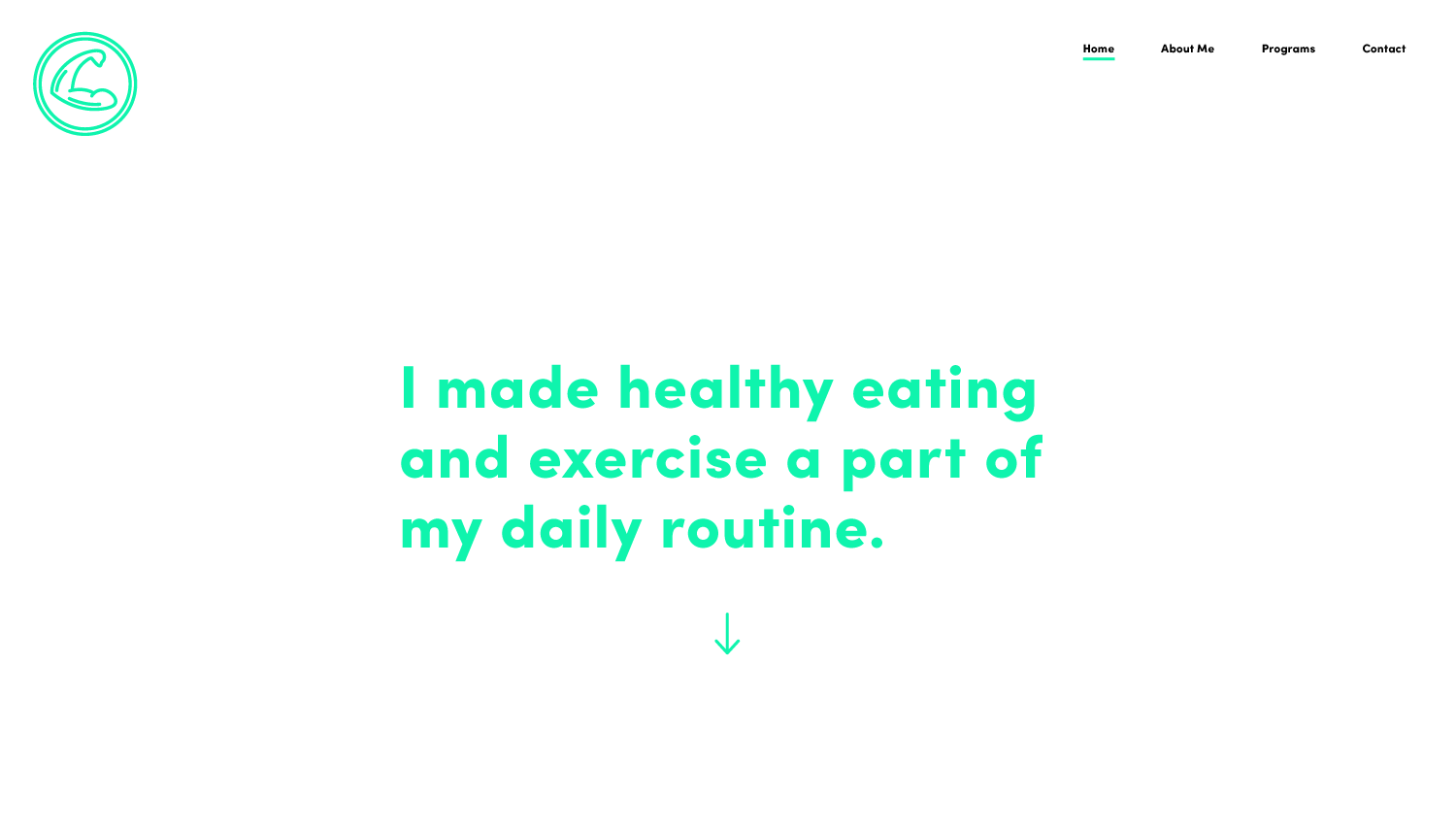
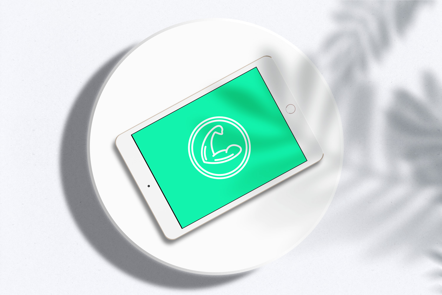
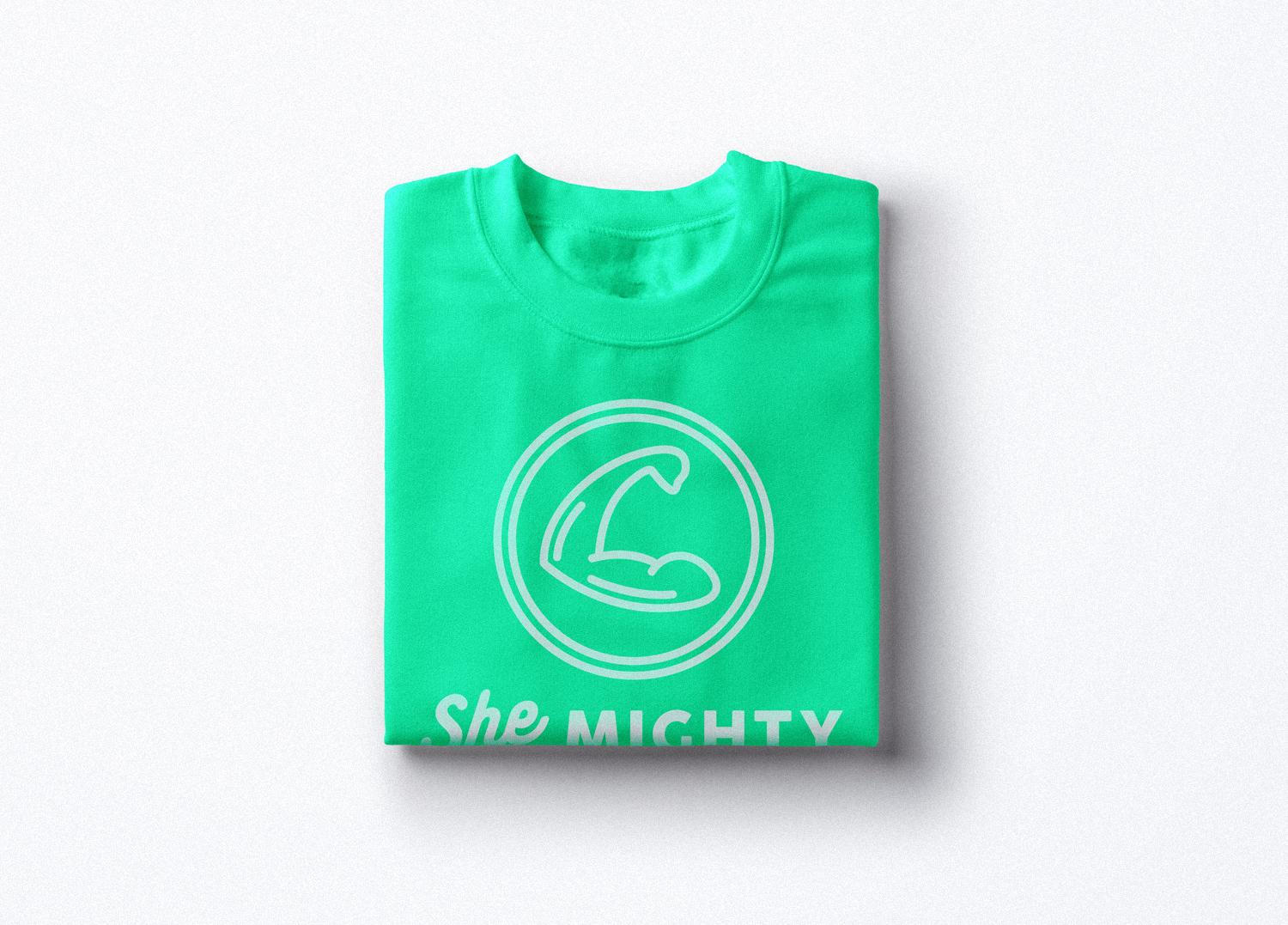
Logo Symbol
Wordmark
The Challenge
Until now, She Mighty had only existed as an instagram account. Working directly with the founder, I created the company’s first logo, brand and website.
In my research before we started, any search for the term “she” resulted in virtually opposite iconography from the word “mighty” — which produced almost exclusively masculine results.
Even though the pronoun “she” is in the name, we agreed that we did not want to create a brand that was defined by the typical aesthetics of femininity vs. masculinity.
My Approach
After we agreed on the direction, I set out to create something that eschewed the traditional male-dominant image of “mighty”.
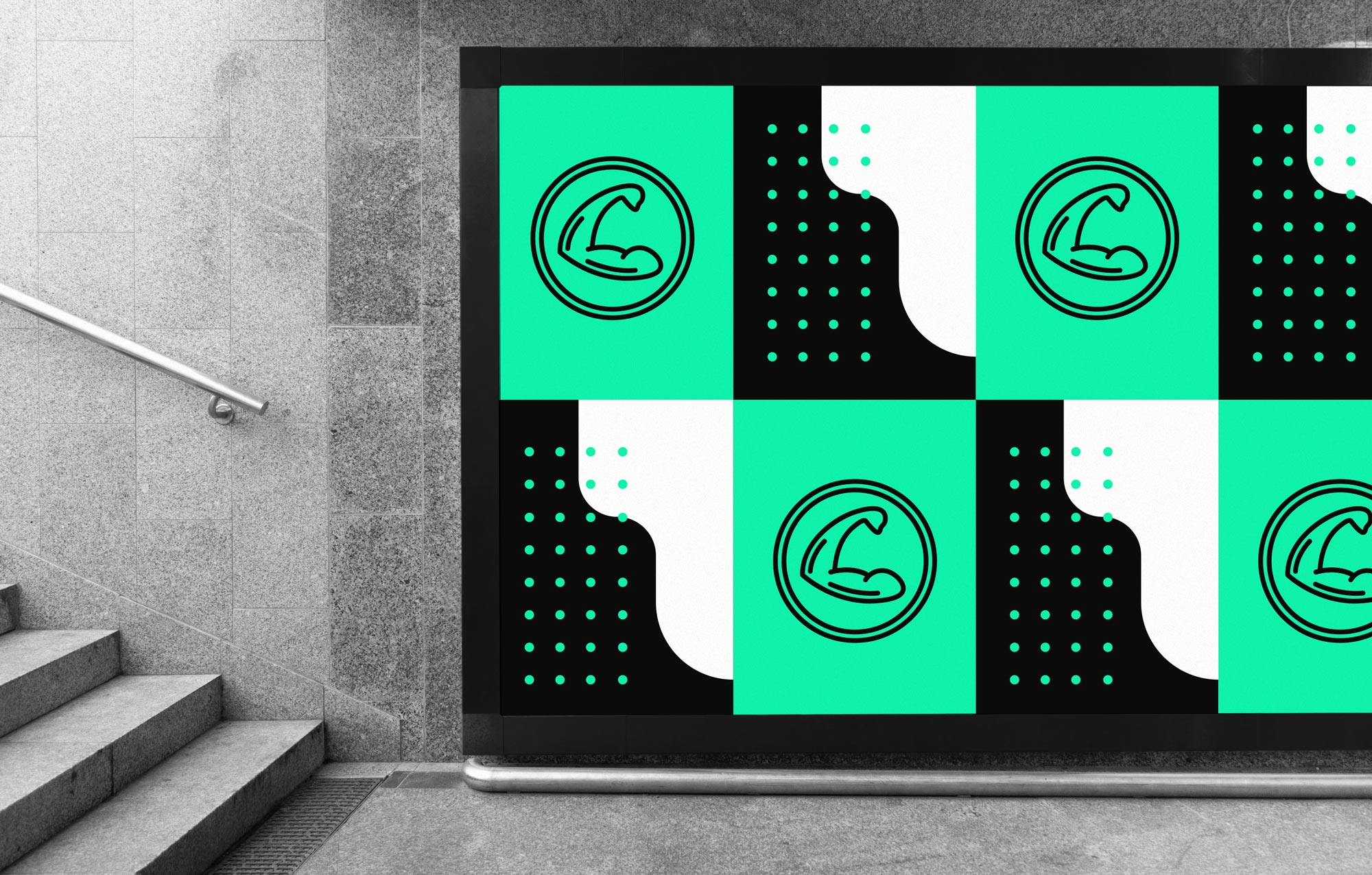
The image of a flexing arm is a powerful and appropriate icon—it felt like the right solution from the off, but it was important to execute it differently.
After sketching out options on paper, I had the narrower, more tapered bicep image that I wanted, which I then traced digitally using a pen tablet.
The Solution
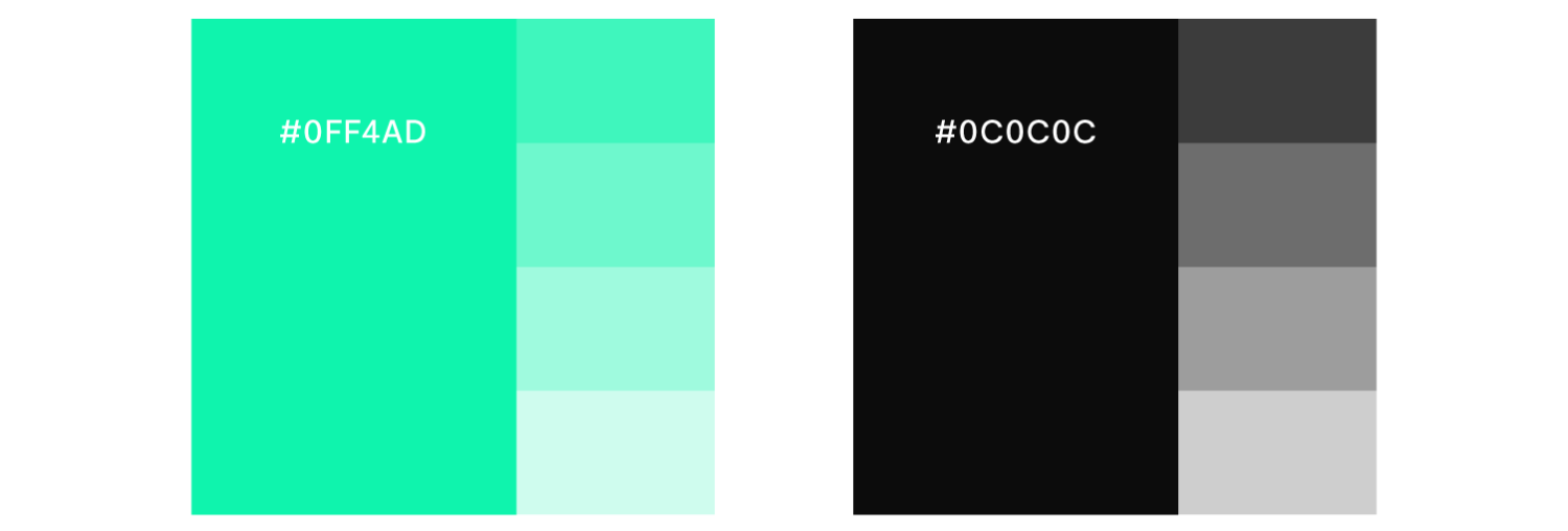
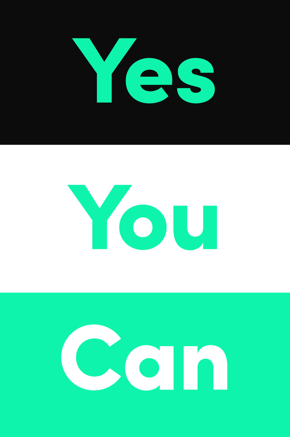
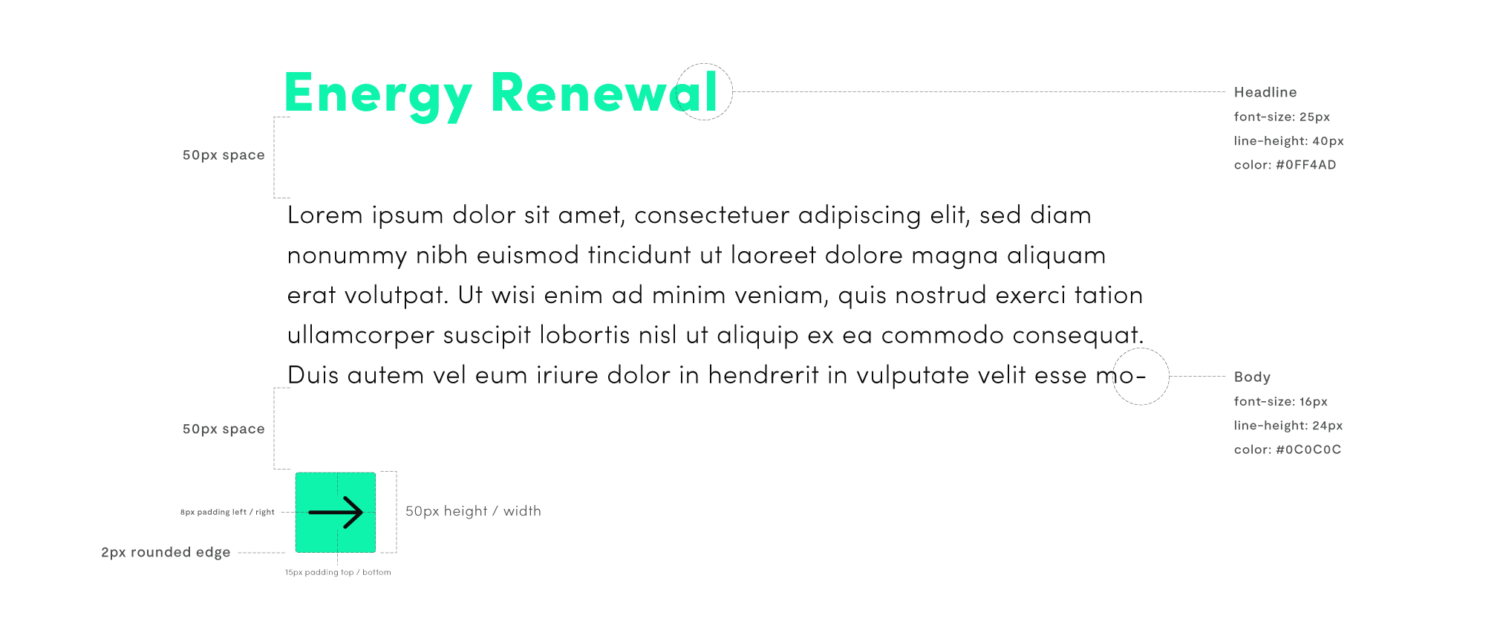
Once we had the logo that we wanted, we agreed on a simple, bright, and energetic color palette, paired with a strong, bold font, geometric splashes, and spacious, minimal layout design.